Landing Page Design Services For Leads & Sales
What can landing page design services do for you in terms of leads and sales? Find out in this guide to landing page design strategy to convert visitors.

Site template vector created by pikisuperstar – www.freepik.com
Landing page design is crucial for getting your website traffic to take action. Without a strong call to action, your visitors won’t know what to do next.
This call to action is typically a button. But the landing page that contains this call to action must be designed to drive your audience to take that action.
Landing pages are conversion focused and there is a science to creating one that is effective. This post is going to look at landing page design services, goals, expectations and strategy to turn visitors into paying customers.
Whether you’re doing it yourself or hiring out, the following are tips for designing a landing page that will convert visitors into customers. Let’s take a look at these important elements of a good landing page.
A Mobile-first Mindset
You should be taking a mobile-first mindset when designing any landing page for leads & sales. While traditional web design principles still hold true, the current ubiquity of smartphones and tablets makes them a vital part of today’s marketing strategy.
Today, 66% of enterprises identify themselves as mobile-first, with 40% of all sales occurring on mobile. As a result, more brands than ever are embracing mobile as a strategic acquisition channel.
Since most landing pages are tied to your website, this means you’re going to need to make sure your website is mobile friendly. For instance, a website that’s not responsive on mobile screens may suffer from subpar SEO results.
Instagram is an example of a mobile-first strategy. Initially a platform for sharing filtered photos, the app has now grown to become a primary social network. It’s now valued at $102 billion, and has projected a user base of over 2 billion by 2021. This success is partly due to the company’s ability to design its landing page for mobile users first, and then expand to other platforms.
While desktop visitors are still the main source of leads for many, a majority of content is at least first viewed via smartphone users. They’re looking for something that’s easy to access without having to work too hard. That’s why mobile landing pages should be designed with a focus on simplicity. A mobile site is designed for quick consumption, so content needs to be short and colorful. Key points shouldn’t be slashed; rather, they should be emphasized, which makes it easier for users to read the rest of the page.
Similarly, a mobile-first mindset is useful for established companies. The old-school approach to web design was created for large screens. However, mobile-first design can translate that experience to smaller screens. It’s crucial to take an inventory of your user base and map out the most effective way to make them responsive.
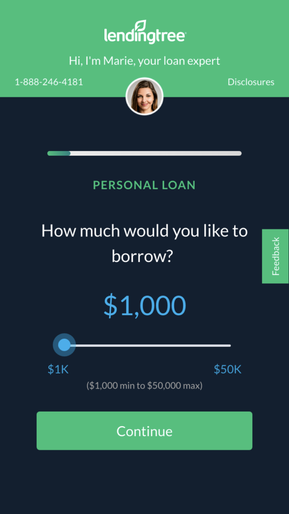
For instance, if you’re designing a loan application for customers, more than half of them are using an old Android phone. Moreover, load time and usability are very important for them.
Take a look at LendingTree’s application process via their website, this is a great example of a simple and intuitive lead generation form:
Focus on a Single Point of Conversion
One of the main problems for small businesses is the lack of web conversions.
Without landing pages, online marketing efforts are simply ineffective. Effective landing page design services offer a simple solution to this problem. The content of the landing page should provide enough information to entice visitors to fill out a form. Once the visitor submits the form, they should be directed to a thank-you page.
You don’t have to be a web designer to build a great intake form!
There are many online form builders that integrate with almost every website. The best form builders out there enable you to create both functional and stylish forms, allowing you to easily store and organize data. They also provide you with reports to spot patterns and come to valuable conclusions. Not only that, but they are flexible to use without having to learn how to code or break the bank.
Determine what your one point of conversion should be for the page for example:
- Capturing leads
- Collecting customer feedback
- Accepting online payments
- Conducting surveys or sharing fun quizzes
- Increasing newsletter subscriptions
- Managing projects and customer relationships
Once you know what your conversion point is, build your form around that. Check out any of these online form builders to help you get it done in minutes.
Create a Newspaper-style Layout
A good landing page layout tells a quick introductory story. A newspaper’s home page, for example, might have an enticing headline and photo. The primary goal is to keep the visitor’s attention.
Newspapers, however, use ‘tease tactics’ to keep readers interested in the content. In this way, you’ll increase the likelihood of conversion. You can use these tactics in your landing page design, too.
To help clarify this ‘newspaper style layout’ let’s take a look at a few different landing page types, because while the ideas are the same the goals and layout are not.
For instance a standard sales page follows this newspaper layout very closely:
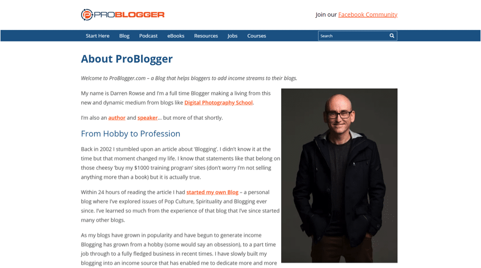
However, creating the perfect About Us page will look a little different even though we’re using the same idea:
When designing an about us landing page, the idea is to build trust and keep people looking. Customers place great value on the creation of a brand story. Not only does it lend the much-needed relevance and context to the brand’s existence – but it offers a chance for the consumers to relate to the story and develop trust. In that instance you can reference what ProBlogger has done to engage their community.
What about an Ecommerce Home Page?
The goal of the home page is not a direct conversion, but rather to direct customers as quickly as possible to the product they’re searching for in order to get that conversion.
An eCommerce home page layout needs to be designed to quickly, accurately and effectively provide several key points to your customer. You should have a good idea of where you need to position design elements on your homepage. Your customers don’t have a lot of patients, so prioritizing information on an eCommerce homepage design can make a huge difference in sales conversions.
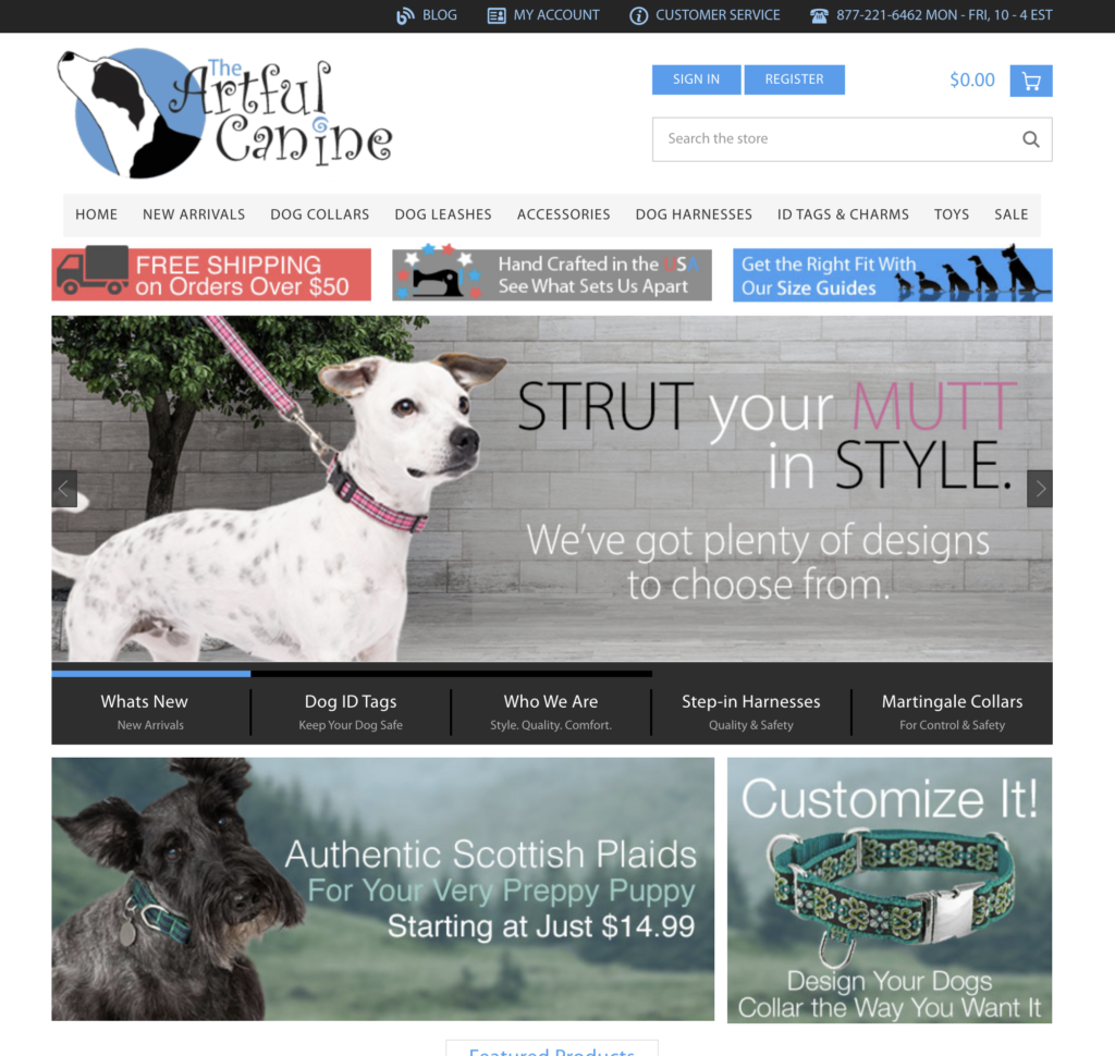
A great example shown below is how the Artful Canine quickly highlights the most popular categories, presents shipping CTAs as well as unique value propositions.
Mastering the Landing Page Fold and Long Form Content
OK. So we know that one of the first things to do is create a compelling headline to get your prospects’ attention. A good headline explains the benefits of the product or service. It should be short and above the fold, and it should be accompanied by a sub-headline that reiterates the punchy headline.
Often the most effective landing pages aren’t short and simple like I previously mentioned.
Sometimes, long-form pages are more effective than short ones. Studies have shown that long-form landing pages produce 220 percent more leads. Moreover, they can help you gain more trust and traffic from visitors. By leveraging the power of length, you can educate and persuade your visitors to convert. It’s especially useful for high-ticket ecommerce products and businesses that require a lot of explanation and trust.
In contrast, email signups do not require as much information.
So, going back to that newspaper reference, we’re going to talk about The Fold and how to design around it when you need to present more information to generate a lead.
If you come across a newsstand in your neighborhood, then you can see this “above the fold” thing in action the way it was originally intended. More often than not, newspapers on sale are folded in a way that only shows their top half, which bears the banner headline and in some cases, a striking photograph.
The primary reason why newspapers are folded and displayed that way is to catch the attention of passersby and make them take in the headline and be intrigued enough by it to buy the whole thing. Judging by the mark newspapers have made in the history of mass media, the above the fold thing actually worked. It’s probably why the digital world—web design in particular—has taken to putting the most attractive and attention-grabbing stuff above the fold as well.
Take a look at this post which goes into a great explanation on the fold:
A long-form landing page will increase your conversion rates by as much as 80 percent.
What else can you include in long form content to make it convert?
It’s also a good idea to include case studies and testimonials. Testimonials help the customer identify with success stories. As with any type of sales page, the key is knowing your customers. Know them well, and make an irresistible offer. The best sales pages know their customers well. In this case, you’ll be able to tailor your copy to match their needs.
What About Product Landing Pages?
So, if you want to engage your users – you better do it quickly.
500 milliseconds isn’t a lot of time so your audience should instantly grasp what your brand’s value proposition is, otherwise you will miss the boat.
The goal of your landing page should be to provide your prospects with just enough information to persuade them take the most important action. The key is less but relevant text plus attractive images equals to an effective landing page.
Using images and videos will improve readability and humanize the page. Make sure to use high-quality imagery to make the copy as persuasive as possible.
Another popular example is Dollar Shave Club.
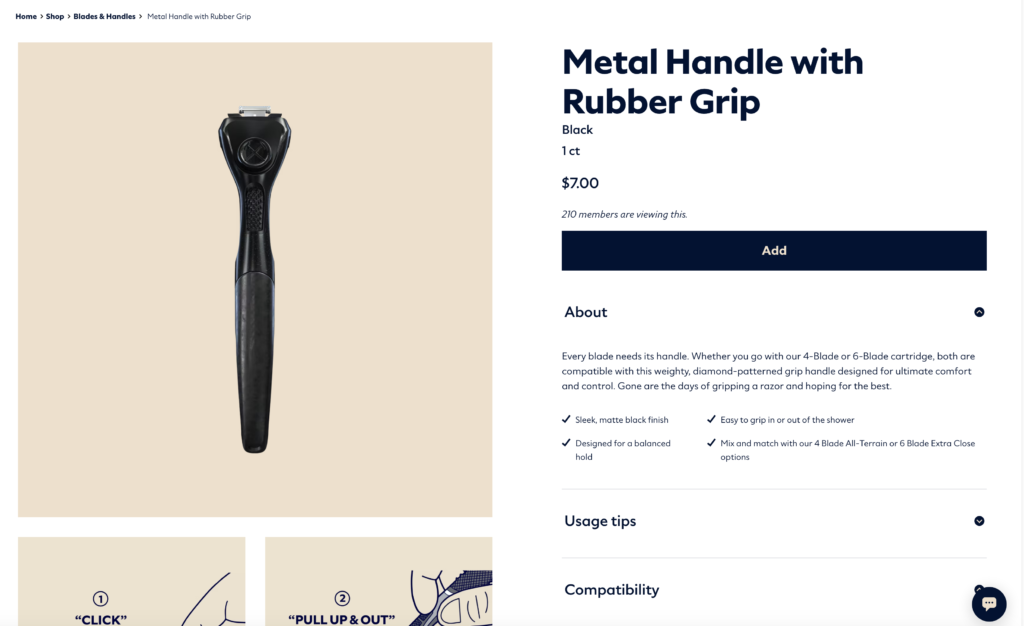
Screenshot: DollarShaveClub
While it is important to keep your headline front and center, it also is essential to place the key selling points and add to cart function above the fold. You may notice some of their product pages utilizing video to help clarify any points of concern all while keeping the user engaged. For more information about designing the best product landing page to convert read this post:
OK. We’ve gone over several different types of landing pages. The rules that and guides that we’ve laid out above are used by every landing page design service, but you have everything you need to do it yourself.
Just Remember: The first thing you need to determine is your pages purpose or intent.
You know; your goal may be to create a page that ranks in search results, it may be to get a sale, or it may be get a name and email so you can make contact to land them.
Building your landing page the right way depends on your goal.
Don’t worry, you don’t have to be a coder to create awesome landing pages that convert. Please check out the following post for the absolute best landing page design tools you can find online. There are a handful of great online tools to help you build landing pages, but you don’t have to look any further than Leadpages and Unbounce.
Go Build Your Landing Page!
As mentioned, you can make use of simple clean intake forms, long-form sales pages if you have a great product. You don’t need a high pressure sales pitch — you just need the right goal and the right tool. Great copy, images and CTAs close sales. Forget about landing page design services and follow the guide and resources provided here and you will turn leads into paying customers.