Creating Effective Product Pages to Strengthen the Customer Experience
Product landing page design is an integral part of enhancing the customer experience and running an effective online sales strategy.
This year’s Amazon Prime Day blew away sales expectations, with U.S. orders topping last year’s sales by 50 percent and global orders rising by 60 percent. Analysts estimate the event added $500 million to $600 million in incremental sales to Amazon’s earnings, as Prime Day’s sales success depended heavily on effective marketing.
Amazon’s product page design also played a role. For instance, some product pages promoted “lightning deal” sales that only gave consumers a small time frame in which to purchase specialty sales items. As Amazon’s Prime Day illustrates, product page design is an integral part of enhancing the customer experience and running an effective sales strategy. Here are some other examples of effective product page designs to help guide customers through the online shopping process, all in an effort to create more positive experiences and higher sales conversions.
Optimize Product Description Titles
One best practice Amazon recommends is optimizing your product titles and descriptions for them to show up higher on search engines results. Some examples include the mention of key descriptive features, including the brand name, product description, color, size and manufacturing materials.
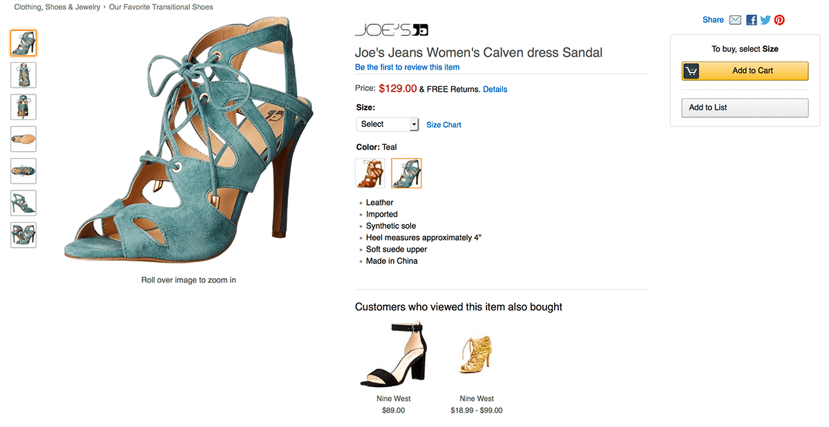
One product sales page that exemplifies these best practices is one T-Mobile created for the Samsung Gear S2. The webpage includes the product’s brand name as well as a pathway guiding consumers and search engines toward customer reviews and other technical phone specs. These features help increase the likelihood that online customers who are already searching for and interested in the Samsung Gear S2 will be guided toward T-Mobile’s website.
Include Relevant Search Terms
Beyond the webpage’s title tag and header showcasing the Samsung Gear S2, T-Mobile’s product page also includes relevant search terms to flesh out the product description and other key sales points to pique customer interest. For instance, above-the-fold text prominently displays the product’s price and a financing offer for $0 up front. Consumers will also discover the smartphone is water-resistant and dustproof. In the end, all this information serves to illustrate another best practice recommended by Amazon: including as many relevant search terms as possible throughout the page.
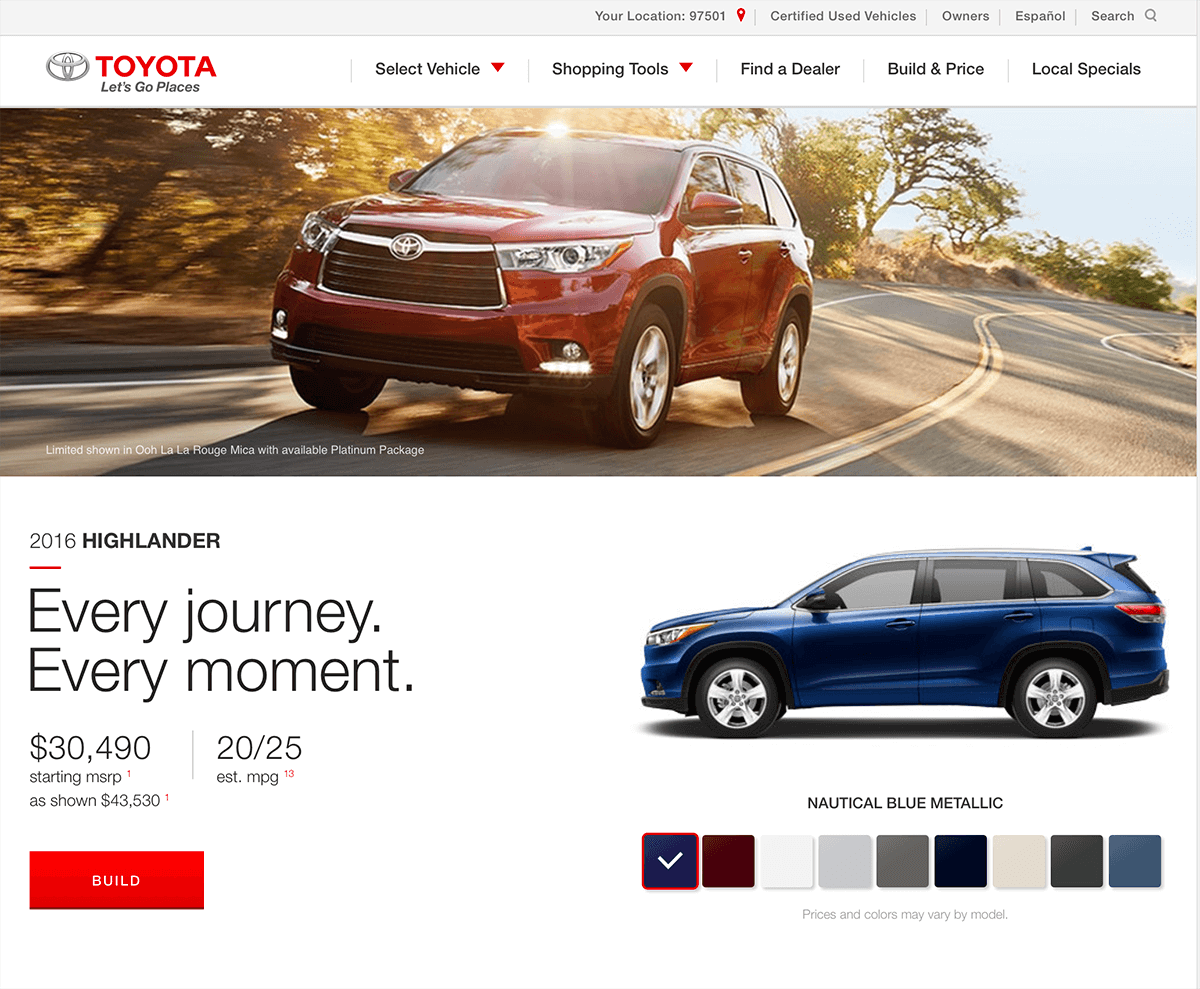
Another product page embodying these principles is Toyota’s sales page for its 2016 Highlander. In the banner area and other above-the-fold elements, key sales features, including a cash-back offer, product price and estimated miles per gallon, are highlighted. Further down the page are additional descriptions incorporating other relevant search terms that highlight specifics about the vehicle’s interior and exterior, design package, performance capabilities and safety features. These keywords not only engage search engines, but also are the main selling points consumers want answered before signing on the dotted line and driving away with a new vehicle off your lot.
Design Your Layout to Fit Your Sales Flow
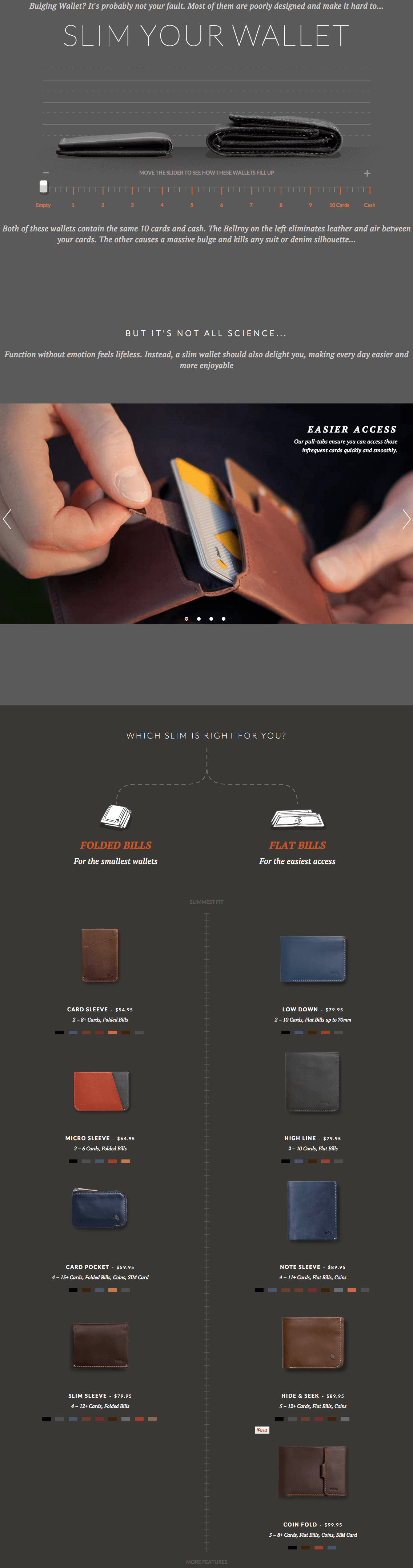
In addition to text elements, graphics also play an important role in the design of an effective online sales page. Use your layout to support the flow of your visitor’s decision-making as you guide them through the sales process. A page promoting Bellroy’s slim wallets illustrates this point superbly. The product page is visually structured around three stages of the sales process.
- The first section depicts the “problem” about how fat wallets make for an unpleasant experience (tears or holes in the back pocket of your pants and a literal pain in your rear end) compared to thinner wallets on the market. There’s even an interactive sliding bar feature, allowing visitors to see how the problem unfolds between the fat and skinny wallets in a side-by-side comparison.
- The next section shows how the problem can be fixed by designing pull tabs to more easily access rarely-used items (perhaps your library card, voter ID and certain reward stamp cards) in your wallet that can otherwise become difficult to extract.
- The third section uses a flowchart to showcase how Bellroy’s product line can help solve this problem for consumers, with various options laid out by wallet size. Each product on the flowchart also includes pricing information, allowing consumers the ability to quickly compare items side by side before ultimately (you hope) making a purchase.
Crafting landing pages designed to convert is both science and art. If you’re running an online store you will want to focus on the details of your product landing pages.