10 Tips to Develop Effective and Responsive Websites
Mobile responsive websites are a must for delivering optimized content across devices, but not all responsive websites are effective – keep reading.
If you are thinking of creating a website for your business or even looking to increase engagement and conversions by updating your site, designing a responsive site should be one of your first steps. With technology becoming more and more mobile every year, the amount of flexibility needed for users to enjoy a uniform experience on any device has increased.
Here are 10 tips to get you started developing engaging and responsive websites.

1. Mobile Responsive CSS Media Queries
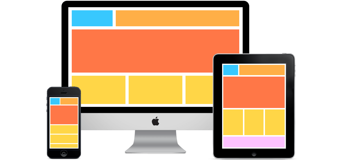
Using media queries is an important responsive CSS technique in optimizing a flexible website for different environments. By using the @media rule it will only include certain CSS properties and only if a certain set of conditions are true. Media queries are responsible for changing the layout of a page depending on the orientation, width, height, and screen resolution.
2. Optimize for Mobile

Depending on your business and how your consumers most frequently use your site it may make sense to design with a mobile-first approach. This allows you to see how images, logos, text, and other elements will look on smaller screens first.
3. Rely on the Cloud
More and more industries are looking to the Cloud when it comes to superior internet storage and performance. Establishing public cloud connectivity can reduce your network costs, increase bandwidth and provide a more consistent network experience than public Internet-based connections. Using cloud-based services over a private network allows for a superior experience with greater reliability, increased speeds, and fewer delays. Using the Cloud to host a static website is a good option for site pages that rarely change such as blogs and other information-based pages for small businesses.
4. Site Speed
Today, timing is everything. Users expect your website to be able to load content quickly and efficiently on all platforms, often in less than four seconds. Non-optimized content and overloaded sites are the biggest reasons for a slow loading site. The quickest solution to slow loading is to get rid of excessive elements and compress any oversized images with a program like GZIP.
5. Create a Unique 404 Page
A 404 page appears if someone has entered an incorrect URL, if your server is down, or if a page has simply changed locations. Unbeknownst to you, this may be one of the most frequented pages on your site. Most businesses settle for a generic “oopsy” page, but this is a perfect opportunity to turn a user’s negative experience into a more positive one, and a potential lead-capturing opportunity. Be on-brand, creative, personal and humorous if applicable. Include helpful resource links, suggestions, a lead form and depending on the business, maybe even offer a discount
6. Natural Navigation
When it comes to navigation, you want the user to be able to follow the flow of your page as easily as possible on any device, just as they would on a desktop. Keep mobile navigation short and targeted by listing the most important information first. You want your navigation to be as intuitive as possible throughout the site. A disorganized or confusing navigation interface will result in a high bounce rate. Offering engaging, streamlined content and navigation hierarchy will keep users on your site.
7. Implement Clear Call to Action
Once visitors reach your website, do they know what to do next? They won’t know what pages to view or actions to take if you don’t provide them with some sort of direction. Call-to-action buttons are one of the many elements that indicate the next step the user should take on a page. While many of us know that, it can be easy to fail by using them inaccurately to guide users through your website.
8. Include Social Share and Follow Options
You may have an excellent website with quality content but this will only go so far if not enough eyes are seeing it. Give an easy way for viewers to share your content via social media channels by including social share buttons. They are easy to add around the top or bottom of posts, or as a tracking side panel so users have easy access as they scroll. This is a non-pushy way of encouraging social sharing and a (free) opportunity to grow your community and increase your customer base.
9. Appropriate Design
Readable language and optimized typography are just as important as images and visual design elements. The user shouldn’t have to either zoom or pinch down to read the text properly. The ideal text sizing is a standard 12 or 16 point font, and the most appropriate image formats for reducing scaling and bandwidth issues are .jpg, .gif and .png. Button sizes should be kept to approximately 44x44px so that the users can use them easily.
10. Start With a Pre-Designed Theme
If you are not sure where to start extra help is readily available by way of pre-designed themes and layouts. If you are not a designer or simply don’t have enough time to create the design you are visualizing, WordPress and many other free and paid platforms offer the building blocks for you to get set up hassle-free. For the most part, all you will need to adjust is the colors, branding and original content for your company.
Responsive design is not just a fleeting trend. As the number of people using mobile devices increases it will become an ever more important long term strategy worth investing in. In order to best serve your customers, no matter the new technology evolving on the market, your website needs to seamlessly meet their needs on every screen.