Best 7 Web Design Tips to Get More Conversions
Way too many websites get absolutely no action, if yours is one here are 7 web design tips that will get more conversions.

Your website’s design is more important than you think.
According to Toptal, first impressions are 94 percent design-related, and judgments on website credibility are 75 percent based on a website’s overall aesthetics.
Such insights prove just how web design can either make or break your business’s online presence and that the elements that go on your website need to be chosen carefully. It’s not just about getting traffic — it’s about what happens when people do visit your site.
Based on those key visual elements you will need to create an effective structure, offer readability and responsiveness, and create eye-pleasing aesthetics that will convince the consumer to buy from you. This is called a conversion and if you’re not getting any then this article is for you.
If you want to know how to motivate your customers, learn how to improve the design of your website with these tips to get more conversions.
#1 Choose Strong Typography
Although often underestimated, typography directly influences the conversion rate.
Typography isn’t just the choice of fonts rather than the typeface – a group of characters, letters, and numbers that have the same design, the fonts, the line length, the space between the baselines, letter spacing, and kerning – the white space between individual characters or letters.
When all these are combined nicely together they can create a good typography example.
Good typography encourages people to trust you and prompts them to take action. It reflects a certain personality, improves readability, and also makes people want to stay on your website for longer.
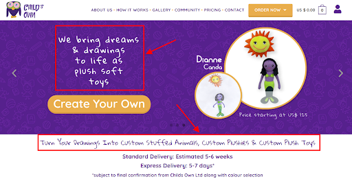
A good typography example from Child’sOwn
To be effective, you need to choose a font that is readable at small sizes for your navigation and interface text. But you can be more creative with your headlines and choose to use a decorative or more embellishment-heavy font for one or two lines.
In the article where he talks about typography, Neil Patel poses three important questions to choosing the right fonts:
- Does your font correctly reflect the message you are trying to portray?
- Does your audience require a formal tone?
- If so, how well is your font setting that tone?
Think of your brand and try to work around typography that helps to bring it out. Also, link it to your branding message while considering audience demographics.
#2 Add Social Proof
Building on trust is a huge game-changer, especially when building a high-converting site. If you want people to purchase your products, first you need to show them they can trust you. So, if you want to get more conversions for your website — add social proof.
Apart from choosing high-quality images, you also need to create social proof around your products. Social proof can take many forms so there are many ways to do this.
For example, you can get expert or celebrity social proof that features authority figures in your industry or a famous person who shows trust in your product. Or, you can show customer testimonials and reviews to have existing customers talk about your product – how they used it and how it helped them.
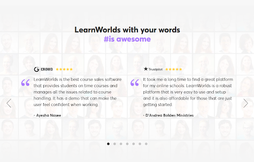
Customer testimonials on LearnWorlds
Last, you can add highly recognizable partner companies or experts to your site to boost your credibility. Featuring their logos or mentioning their names on your website gives potential customers another reason to put their faith in you and reach out.
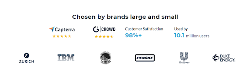
Social proof by Visme
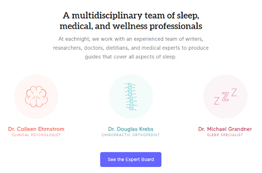
Experts partnership by Eachnight
#3 Organize Page Elements Using the F-Shape
If you want to get more conversions, you need to consider website navigation.
While you are designing your website, you need to make sure that your landing pages are constructed in such a way as to help people follow the path you want them to take while on your site.
As your site visitors land and scroll down your page, they are following the visual cues you are providing and they are reading your copy or seeing those visuals that stand out.
However, research by the Nielsen Norman Group revealed that most site visitors’ eyes fell onto specific areas of a web page forming a dominant reading pattern that looks like the F shape. This eye-tracking study showed that the reading behavior was consistent across many different sites and tasks as users were scanning the page in the same way.
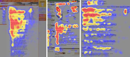
Eye-tracking by Nielsen Norman Group
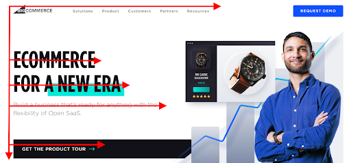
Big Commerce’s website with F-shape pattern
This is information that as a marketer or business owner, you can use to your advantage. Choose to position your most important data where site visitors are most likely to see it or read through it. Doing so increases the overall chances of them engaging with your content.
#4 Use Colors Wisely
Just like typography, when colors are used appropriately on your website can help create a harmonious, coherent, and aesthetically pleasing effect, that adds more power to your branding.
The best way to go is to choose up to three colors and create a color palette that reflects the personality of your brand.
Don’t simply use colors that you like or think would look ‘nice’ for your brand. It is best to investigate it further before you are ready to decide which ones work best for your business. If it helps, look at what other companies in your industry are doing and take examples from there.
Once you choose your brand colors, use them effectively on your website while allowing room for white space. This is to help the site look as ‘clean’ as possible.
Call-to-action button on Zoom’s navigation menu
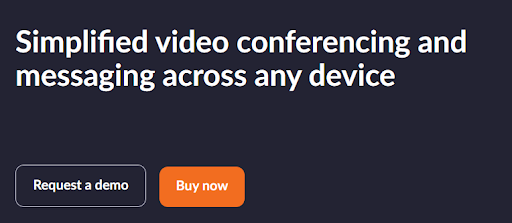
Call-to-action buttons on Zoom’s blog
Also, you can use colors to bring out those elements you want people to click on like call-to-action buttons – CTAs.
CTAs are one of the most neglected tips to get more conversions — don’t overlook this item. Zoom does it really well using the combination of blue, white, and orange to give emphasis on specific action buttons like ‘Buy now’ and ‘Sign up! It’s Free’.
#5 Improve Your Copy
There is no shame in admitting that you need to improve your website copy.
Besides, now and then you need to change it to ensure that it still resonates with your target audience, and performs well with your promotional campaigns.
Getting it right takes time, but it is essential to do so because it can help bring out your value proposition and present your products and brand, in the best light possible.
Sleeknote’s website copy
The copy is used to tell a story through text but more often than not; it goes beyond mere words.
It also includes any icons, images, graphics, or videos that are on your website.
If you are unsure of how you can make these elements work together nicely, you can always hire a professional copywriter to help you optimize your content. In the meantime, you can also choose to only add high-quality videos, images, graphics, or even illustrations you produced internally, avoiding stock content that may have already been used elsewhere.
Also, don’t forget to check out The Daily Egg’s copywriting formula suggestions, which can come in handy.
#6 Remove distractions
To get people to click on your main CTA button and move them further into your sales funnel, you first need to ensure that you are making it as easy as it can be.
A huge part of keeping your website ‘clean’ is avoiding or removing all clutter that is considered a distraction. A distraction is anything that is preventing or slows your site visitors from taking the action you want the most.
This may be multiple CTAs on a page that make the consumers’ decide-making process more difficult, many high-contrasting colors, moving images, big headers and sidebars, unnecessary text, or any other competing design elements that require attention and make the website look busy.
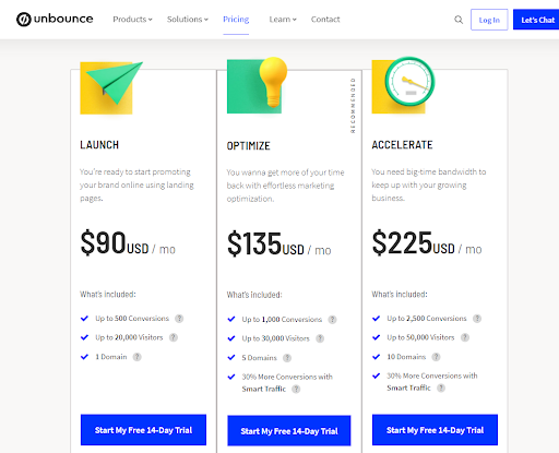
Unbounce’s pricing page
By comparing Unbounce’s pricing page with BuzzSumo’s, you can tell who did it better.
While both pages work great, BuzzSumo takes the lead because it makes it clear where they want to direct their site visitors – their PLUS plan is the most popular and gets the blue CTA that makes it stand out.
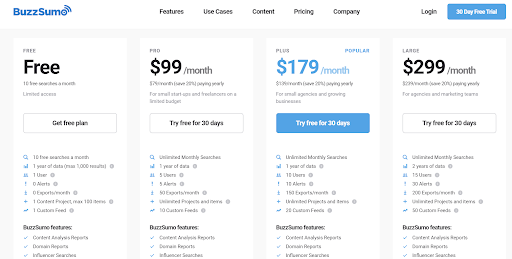
BuzzSumo’s pricing page
To eliminate on-page distractions, consider using some visual hierarchy principles that can guide you.
The visual hierarchy should help you figure out what elements are fundamental and need to go on top or at the middle of the page, need to be bold, or stand out in any other way as opposed to secondary elements – those elements that are not relevant to site visitors taking action.
#7 Listen to Your Customers’ Feedback
You know what they say – ‘the customer is always right’.
Customer feedback should always be welcome and so if any customer expresses their dissatisfaction with navigating your website – or anything else, you need to look into it. Any feedback can help you improve your site’s usability and help ease the customer’s journey.
To get the information you need, reach out to your customers and get their opinion. You can do this via email or by creating a quick survey they can find on your web page that asks all the right questions.
A few examples:
- What would you change about the website?
- How easy is it to get what you need on our site?
- How would you rate the overall experience with our site?
If you need help coming up with the best set of questions for your customer feedback form, HubSpot can help you out by giving out some cool customer satisfaction survey templates.
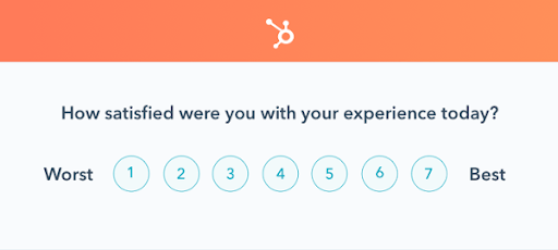
Sample of customer feedback question from HubSpot
Ready to Create a Website That Converts?
To successfully create a conversion-based web design for your website, you need to consider those key visual design elements that will attract and take your site visitors to the checkout page.
Following these seven simple tips to get more conversions mentioned here and staying up to date with the latest graphic design trends, will help you make the necessary changes to your website and encourage more visitors to check out your products.
Whether you are selling or physical or digital products, your website is the go-to place for those who want to find more about your company. So, do your best to make it stand out from the rest!