Logo Colors: How to Know What’s Right for Your Brand (+ Examples)
Did your designer simply hue-saturate your logo colors until they looked nice? Learn how to properly select logo colors and we even include examples.

Source: depositphotos.com
One of the most important steps any brand will take is choosing its logo, but don’t let the color of your logo be an afterthought.
Logos define how companies are perceived and what kinds of emotions and thoughts people associate with them. The most famous brands’ logos are unmistakable. There are even quizzes and games that test your knowledge of them. The color of these logos is not an afterthought — they are well researched and designed to fit a specific psychological profile.
This color psychology starts with your logo and shapes your entire brand profile.
Are you ready to get a better understanding of how logo colors communicate your brand messaging? Here’s what you need to consider when choosing your brand’s logo colors.
Some Basic Color Psychology
Whether we like to admit it or not, we associate certain emotions with colors. It is, in most part, a completely unconscious process, embedded in our psyche by history and popular culture as well as by our personal experiences.
While there are plenty of cultural differences to take into account, here is a basic rundown of what each color means to help you choose the right one for your logo:
Red
Red is the color of passion, anger, and excitement. It will quickly draw the eye in and make your logo stand out in a crowd. If your brand is playful, modern, and vibrant, red can be a good logo color.
Orange
Orange is a playful color, and since it is used less often than red, it can achieve the same differentiation effect. People also associate it with change (sunset and sunrises have something to do with it), so if you consider yourself a little bit different and out there, orange is a good choice.
Yellow
Yellow can be quite a diverse color, depending on its hues. In essence, it exudes cheer and friendliness, and it’s a great choice if you are a fun and vibrant brand that you want people to associate with happy emotions.
Green
A green logo can work well for just about any kind of brand. It is most often linked to the natural world, so vegan and eco-conscious brands often use it. If you fall into this category, you may want to go for a different choice, just to stand out.
In the US, it is also associated with money, but this does not apply to other cultures.
Blue
Blue is the most trustworthy color, and it exudes maturity and confidence. In fact, blue appears in half of all logos. Blue also evokes feelings of calm, but it can also suppress appetites, so stay clear of it if you are in the food industry.
If you want consumers and industry peers to take you seriously, this is the one to go for.
Purple
We associate purple with wisdom and luxury, as historically, purple dye was the most expensive, so only the wealthy wore the color. It’s also a playful choice, and you won’t be perceived as overly serious if you choose it.
Pink
Pink is young and hip, so if you are modern or cutting-edge, it can be an excellent choice. Of course, most people still consider it somewhat of a girly color, so consider that as well when contemplating a pink logo.
Black
If you are a luxury brand, black can be your color. It is associated with class and style, and it will look slick and modern in a logo. It won’t work well if you are trying to appear affordable, though.
White
White is an unusual choice for a logo. It can make you look mysterious, and it will certainly make you more interesting. Be careful about using it with too much dark background, as you may achieve an adverse effect.
How to Stay on Brand
Before you choose a logo color, consider how you want your audience to perceive your brand. Which words do you want to evoke in people’s minds when they think of you?
Write down a list of ideas and words that would best describe you, and use them to guide your color choice.
Remember: people will make both conscious and unconscious color associations, so aligning what you want to convey with the color story is a great way to make the best first impression. Consider what we’ve talked about for each color to help you select a combination that hits the nail on the head.
Is Rebranding an Option?

Source: depositphotos.com
You may also be wondering what happens if you get your logo and branding wrong?
What if you discover somewhere down the line that you’ve made the wrong choice and that the logo design and color combination you’ve chosen isn’t working as well as you’d hoped?
While rebranding is always an option, you should still consider it very carefully. If you have yet to establish a steady user base, you shouldn’t suffer too many consequences of this move.
However, if people have already started to recognize your brand and your logo, there may be some bumps in the road ahead. You shouldn’t give up on your idea of rebranding – just make sure you think it through, and execute it to the best of your ability.
8 Logo Examples to Get You Started
To help you get started choosing the right logo colors for your design, let’s see some examples that have incorporated the advice and principles we’ve discussed.
Use a Brand Color
Sometimes the best solution is the simplest one: instead of trying to come up with a specific color story, use one and the same color across your website and in your logo.
This is what Spores did, and their choice of hue also happens to be quite eclectic and unique.
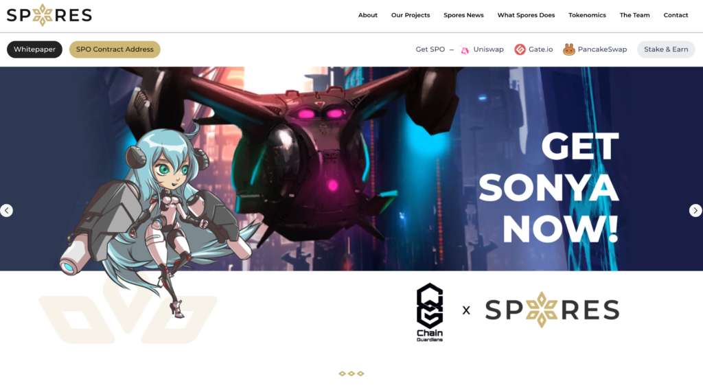
Source: spores.app
Make It Black
Black logos can often be incredibly effective. They appear very professional, and they are not distracting or alienating. The Two Black Dogs Pub also just happens to have the word black in their brand name.
Or Keep it Dark
If black is not your color, you can still keep your logo dark by using darker shades. Whether you go for browns or any other darker shade, the effect can be just as stunning. Just take a look at Deep Brewing’s logo and how well it has managed to encapsulate the brand’s core principles.
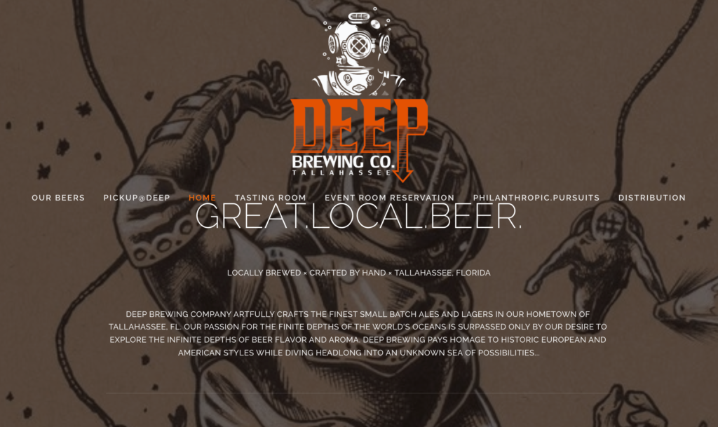
Source: deepbrewing.com
Use the Most Obvious Color
The color combination you choose for your brand can also simply match what your audience is most likely to expect. For instance, Ultimate Meal Plans went for green, which provides an instant association with the healthy foods they are all about. US Fireplace Store uses orange, which is evocative of fires and warm glows.
Make It Vibrant
Vibrant logo colors often work very well, as they are likely to attract some instant attention. You don’t have to make them obnoxious, though. You can still achieve that strong effect with a reasonable shade.
Mrs. Property Solutions offers us a great example here. Her logo is quite noticeable but on just the right side of vibrant.

Source: mrspropertysolutions.com
Use an Entire Rainbow
Rainbow logos don’t have to be reserved for child-oriented brands. In fact, they work just as well in the worlds of tech, marketing, and SaaS. The one logo you already know is Slack’s, but you can also take a peek at Visme, which has done something similar.
Final Thoughts
Choosing your brand’s logo colors is a very important decision. It can seriously impact your success and the way you are perceived from here on out.
If you take a bit of color psychology into consideration and devote some time to looking at a lot of other logos, too, you will certainly land on a combination that matches your brand’s personality and your audience’s preferences.
For more insight on how to deliver value to your customers through logo design, make sure to check out some of these other posts.