5 Ways to Create Killer CTAs for your Electronics Store Website
5 Awesome Electronics Store Templates that have killer CTAs in place with killer tools to make your eCommerce website management and store operations way easier.

The success of your electronic store website will depend largely on how well you design CTAs (aka call-to-action buttons).
In fact, this is true for any estore or a blog. It is a call to action button that has the power to turn an average always-in-a-hurry online shopper into a loyal returning customer.
So, if CTAs are so important, how do you get them designed properly in an electronic store website?
Right below, you will find the answers on how you should style, word, and format CTAs so that they bring you as much profit/traffic and as many shoppers as possible.
Killer CTAs for Electronic Store Website: Wording and Styling
How to Style Killer CTAs
According to 2018 web design trends that will change users interaction, bold fonts and bright colors is what will help your electronic estore stand out in the market. You will find Walmart utilizing these web trends on there site right now.
The goods news is that you don’t have to be a Walmart to put awesome design elements and effective CTAs to work for you.
There are many professional electronics web templates that contain numerous tools to make your CTAs look stunning both in terms of fonts and colors.
For instance, you can modify fonts of CTAs simply by integrating free Google fonts. Many quality electronics web templates for WordPress, BigCommerce, Shopify and 3D Cart provide built in tools to work with color schemes, fonts, headers, marketing banners and more.
Being able to quickly edit and effect global color changes to match your brand and incentivize the customer puts you ahead of the game when it comes to managing your online store.
How to Word Killer CTAs Successfully
There are three things you need to remember about the language you use in a CTA button for an electronic store website:
- Online shoppers appreciate the stability of their comfort zones.
That is why do not reinvent the wheel when it comes to wording buttons like “Add to Cart” or “Checkout”. - Time is always running short for online shoppers.
Thus, your message on CTAs has to be clear and to the point. Words like “Subscribe Now”, “Learn More”, and “More Details” do not sound helpful to a person who desperately searches for a reliable electronic store website. Instead, do your best to find a concise phrase that covers a specific aspect you want to tackle. - Online shoppers need the context.
The best worded CTAs are a crowning touch, surrounded by the appropriate text. This is what you find on the Homepage of BestBuy.
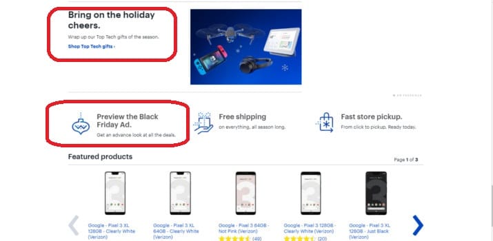
Getting ready for the holiday season and previewing the Black Friday ad does sound like a good idea already now, doesn’t it?
How to Format Killer CTAs Responsibly
There are many different formats of CTAs, as the infographics about best call-to-action designs proves.
For online tech shopping sites, most commonly used formats are on-screen call-to-action and single buttons. These formats are the best if you want to keep your screen uncluttered. It is kind of a big deal for an electronic store website because of the number of products you want to sell.
Another question you might be asking yourself is where to place CTAs so that they are more effective. There is no easy answer here.
The thing is that CTAs can increase conversion if placed both at the end of a webpage and right at the middle of a visible screen. The factor that predetermined the effectiveness of CTAs is how well a user knows a product. Put simply, the longer it takes to persuade a user to perform a call to action, the further this call to action has to appear on a web page.
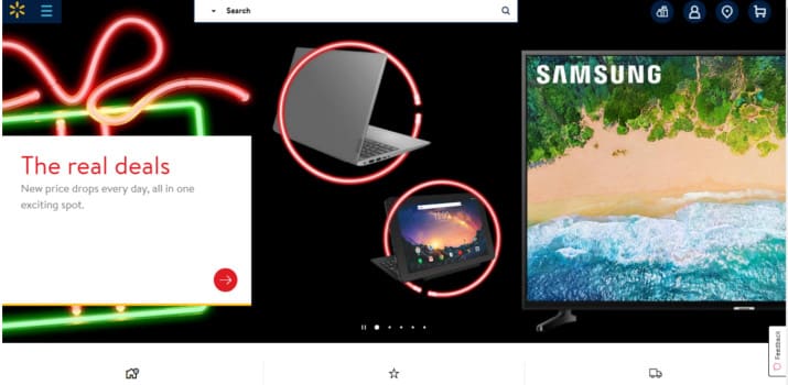
With an electronic store website, your users know the products they are looking for. That is why your CTA should be above the fold to eliminate wasted time. The Homepage of GearBest is a telling example of the fact.

Best Examples of CTAs for Electronic Store Website
If you’re setting up a brand new store to sell electronics, there are a few great templates that will help you get up and running quicker and more effectively with well thought out CTAs and management tools. We’ll take a look at 5 of the best templates for electronics sites.
1. Rufus VR Website Template for Electronics Sites

This is the call to action design that is aimed at shoppers of all ages. Easy to navigate, Rufus is an excellent choice if you want to build a solid online presence within weeks. Register the free two-week trial and make use of elegant popups and the powerful Media Library to sell electronics online.
2. Technics Electronics Ecommerce Website Template

If you need a smart-looking template with the high ecommerce call to action potential, Technics is your top choice. The color scheme of Technics uses blue as the dominant color, which you can easily change if needed thanks to the Color Picker. Test different dominant colors with the Color Picker to create the unique color palette that will increase the brand awareness worldwide.
3. Moox Ecommerce Website Template

If you view the live demo of Moox, you will see right away that the shopping cart you find in this template is user-friendly and visually attractive. Hover over the CTAs in this electronics ecommerce website template to see how black turns into exquisite purple. More than simple color, Moox is a WooCommerce theme that comes literally packed with hundreds of drag-n-drop builder tools, built in newsletter pop-ups functionality for increased customer sign up and so much more. With Moox, you easily offer discount codes, track your sales statistics, as well as integrate video presentations of goods into your product catalog.
4. Electolux Ecommerce Website Template

Electolux is practical and eye-grabbing thanks to the smart call to action design. Easily transformed into an electronic store website, Electolux gives you the unprecedented freedom in terms of the customization. Inform your prospective buyers about the currency, shipping details, payment gateways – all in just a few clicks.
5. Electronix Store Template

Electronix will help you create a dynamic and attractive electronics ecommerce website in no time. Designed by top web designers, this template is 100% user-oriented. The manageable shopping cart, a powerful comparison list, and a friendly authorization web form make Electronix one of the best premium templates for selling electronics.
Final Thoughts
All in all, there is nothing difficult about creating the effective ecommerce call to action for an electronic estore. Just experiment with bright colors and fonts. Messaging is important, so think of unconventional ways of wording CTAs, where appropriate. Place CTAs quite early on your electronic store website. Get inspired by the best designs of ecommerce call to action designs. And voilà – your CTAs are ready to attract new shoppers to your electronic estore!