4 Easy Ways to Improve Your Site’s Navigation
How many website redesigns have gone without updates to the navigation? Too many! Don’t overlook these easy ways to improve your site’s navigation.

Now more than ever, small businesses and larger corporations alike are shifting to eCommerce to fill in the gaps of brick and mortar shopping that COVID-19 has imposed around the globe. If you’re struggling to navigate this new digital landscape, we’re here to help.
In this post, we’ll discuss 4 easy ways you can improve your site’s navigation and user experience. From reorganizing main page structure to changing up colors and design, we’ll share our best tips and provide examples to draw inspiration from.
1. Incorporate CTAs to boost conversion rates
Whether you’re a B2C or B2B, your website should serve two primary purposes as a business: inform and convert. We’ll discuss how you can make your website as informative and easy to use as possible a little later on in this post, but for now, let’s talk about conversion.
One of the most effective ways you can transform website visits to dollars is by making it as straightforward and enticing as possible for visitors to buy, donate, sign up, or do whatever it is that you want them to. CTAs, or “call to actions” are just what they sound like, messages encouraging website visitors to take action.
CTAs can come in the form of banners, buttons, and simple lines of text. No matter what design is used, all good CTAs are straightforward and enticing. There should be no question of what the button is saying or where it’s going to take you once you click.
Let’s take a look at an example from GoodLife Home Loans reverse mortgages page. On this page, your eye is automatically drawn to the CTA that they want you to look at: “Screen Today.”

CTA buttons are especially useful for customers who have already made up their mind about purchasing a product or subscribing to a service. Placing these calls to actions throughout your website makes it easy for new and returning customers to take the action you want them to. For this business, it’s to get the visitor to start the reverse mortgage process.
Another good example of a call to action that draws the eye is on the homepage of an apartment search site, WhiteRock Locators.
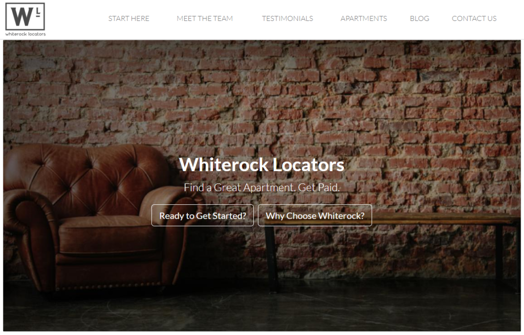
Something you’ll notice about this example is that the rest of the page is relatively simple, which makes it easy for a user to understand what’s going on and navigate the site without feeling intimidated or confused. Giving two choices in your CTA buttons is a great way to push a customer in the direction they’d like to go first.
2. Use a straightforward template
Thanks to pre-fabbed templates, building your business’s website is easier (and more important) than ever. But if you decide to DIY your website, make sure that you use a design that’s simple and pleasing to the eye. Using too many colors, loud fonts, or clashing layers makes it difficult for users to understand what to do and where to go for information, plus it could give your potential customers an unpolished, unrealistic view of your business.
Let’s take a look at another example. This time we’ll look at a website that doesn’t follow good design practice.

Now, put yourself in the position of one of your customers—would they know what to do or where to go after landing on this page? Maybe. Maybe not. The navigation links on the side are difficult to read because of the photo in the background and clashing font and color on the overlaid text. The point is, any customer that goes to your site should immediately know how to access what they need. The quicker your site visitors can make a purchase or give you a phone call, the faster you can turn their website visit into a sale.
3. Test site speed regularly
Another important component of your website is its speed. We’re all familiar with the frustration of going to a website that takes forever to load, or worse, cuts out just as you’re about to finalize your purchase. To keep your customers coming back, it’s important to continuously check your website’s speed.
There are several free online resources you can use to test website speed, including:
- Google PageSpeed
- WebPageTest
- Pingdom Tools Website Speed Test
- Dotcom Tools Website Speed Test
Ideally, your website should load within 2 to 5 seconds, but some experts say that anything over 2 seconds increases the likelihood that a user will bounce from your site back to the search results. As a result of high bounce rates, Google may list your website lower in the rankings which could cause a reduction in your site’s traffic.
4. Use compelling imagery
They say a picture is worth a thousand words, and that’s definitely true when it comes to web design. When you’re trying to make sales online, your customers don’t have the ability to touch, try on, or test out the product that you’re selling, so it’s important to make sure they can visualize that experience online.
There are many ways you can do this depending on what you’re selling. Let’s take a look at an eCommerce example and a tech product.

Example 1: eCommerce
Since online shoppers don’t have the flexibility to try on items or see how they’d fit with their style, so it’s up to you to do that for them. Take this product page for example. The vendor highlights several angles and two different styles to show off how shoppers can pair the skirt with different items in their closet.

Example 2: eCommerce
Here’s another great way you can help your shoppers see themselves in your products: use the support of your customers. In the image above, this brand shows off social media photos of customers of all shapes, sizes, and colors in their activewear. Of course, you’ll need to get customer consent before posting!
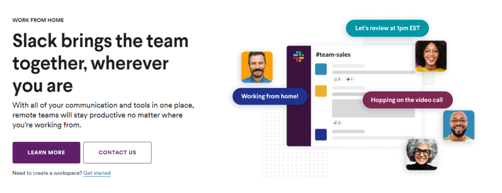
Example 3: Software
Selling tech through images isn’t quite as straightforward as selling clothing, but it can still be done! Just take a look at Slack. By displaying happy, diverse faces with relevant messages, the imagery speaks to the user’s experience. This makes it much easier for the user to imagine how Slack would fit into their day to day work life.
Wrapping up
Incorporate these four design strategies and your UX and conversion rates will surely benefit because of it!