Web Design Case Studies You Can Use Get Your Site Working
Feel like your website’s a waste? These 14 Web Design Case Studies will help get your website working for you instead of wasting your money.

Design Advisor has done the research and put together a powerful infographic based on 14 real world web design case studies that changed these businesses — Find out how.
A professional website is essential for any business.
Even knowing this information,
36% of all small businesses still don’t have a professional website,
according to Clutch’s 2018 survey.
As a matter of fact, the internet is increasingly becoming the most important channel for attracting and retaining customers. Stats compiled by Design Advisor reveal that almost half of your website’s visitors consider the quality of web design to be the most telling factor about the credibility of your business.
A whopping 75% will make judgments about your business based on the state of your web design.
That’s why it is vital to stay abreast of the latest trends and know what does and does not work for your type of business or industry.
Even more importantly, many businesses are suffering from poor website design. Anyone can get a website up and running with a few simple clicks these days, but that isn’t going to guarantee traffic or conversions.
In fact, 94% of visitors bounce from a website that has an outdated design.
Chances are, that you may be one of those business owners, wondering why your website isn’t working for you.
Why isn’t your website generating traffic?
Where are the leads?
This post is based on 14 web design case studies of real businesses who were asking these same questions and how they corrected them with updated web design – Infographic Included!
This might be a good time to give your website a new beginning as well.
If you’ve been looking to revamp your website and need some inspiration, check out the nine pointers listed below. Sometimes even one or two small changes can make a world of difference, leaving you with web design you can be proud of.
Let’s take a look at 9 key take-a ways that you can easily implement on your own site based on the web design case studies by Design Advisor.
1. Break up those grids
Are you still using a conventional block grid with a uniform and symmetrical layout?
The latest trend is to break up your grids for a more asymmetrical look.

This gives your pages a less formal appearance while allowing the readers’ eyes to flow naturally across the pages. Breaking up the grids also allows for things like overlapping and layering which can create unexpected and interesting formations such as juxtapositions, which are likely to grab and retain the attention of your potential clients.
2. Choose your colors wisely
Colors have such a powerful effect on the human psyche, often on a subconscious level.
The color scheme of your web design can either attract or repel your users.

Current trends lean towards a natural color palette, but depending on your industry or sector, certain colors tend to work better than others. For example, red is a firm favorite in retail and often used for sales and clearances as it is the color of excitement, boldness, and urgency. Blue, on the other hand, sends a message of trust, tranquillity, and productivity.
3. Let your menus float
Does your website menu disappear when you scroll down the page?
If so, you might want to consider installing a floating menu (sometimes referred to as a fixed menu).
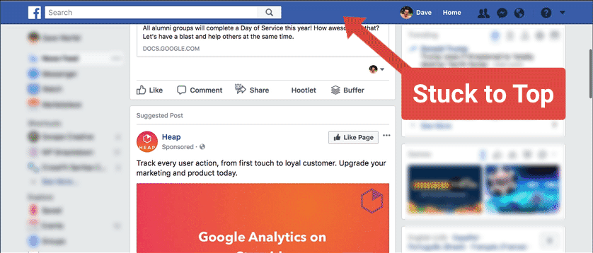
This type of menu remains visible at all times, as it “floats” on top of the page, even when the user scrolls down. This makes it easy to navigate to other pages without needing to scroll back up to the top to find the menu again.
4. See to your calls to action
Firstly, do you have a call to action button on your website? If so, how prominent is it?
The CTA is very important for prompting the desired action from your audience.

By providing a clear path towards completing the action you increase the chances of it happening. But your CTA button must stand out. The most common way to achieve this is by using bright and bold colors. If you opt for a pop-up page, make sure it doesn’t appear too soon after a visitor lands on your site – give them a chance to look around first.
5. Figure out your fonts
The range of fonts available nowadays is considerable.
What font are you using? Is it easily readable? Does it stand out?
Serif font designs are trending, as is using multiple fonts throughout their web design. There are all sorts of inventive typographies, and you might even like to invest in a custom font design. Whichever font you choose, it needs needs to convey your message in the clearest possible way, with headings that stand out boldly and can be quickly read at a glance.
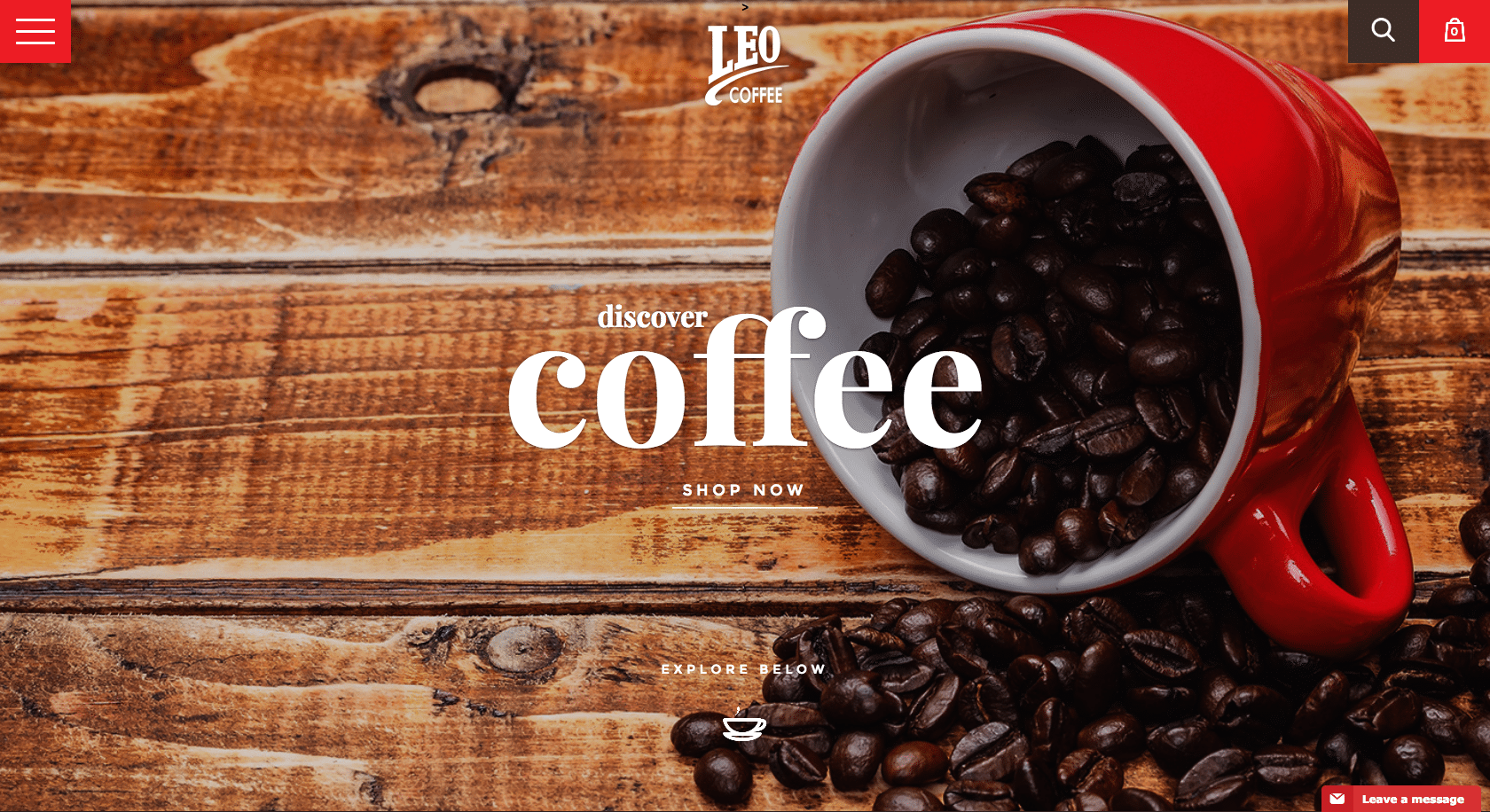
6. Make the most of illustrations
They say a picture is worth a thousand words, and web design is no different.
Let’s face it; most people will look at the pictures before they read the words! A popular trend these days are playful illustrations such as cartoon figures which add a touch of humor and fun, giving your website personality. Additionally, illustrations can also be animated, and on a similar note, it’s worth mentioning that video is another trending element at the moment.
7. Use data to tell stories
Presenting data doesn’t have to be boring — just look at data storytelling!
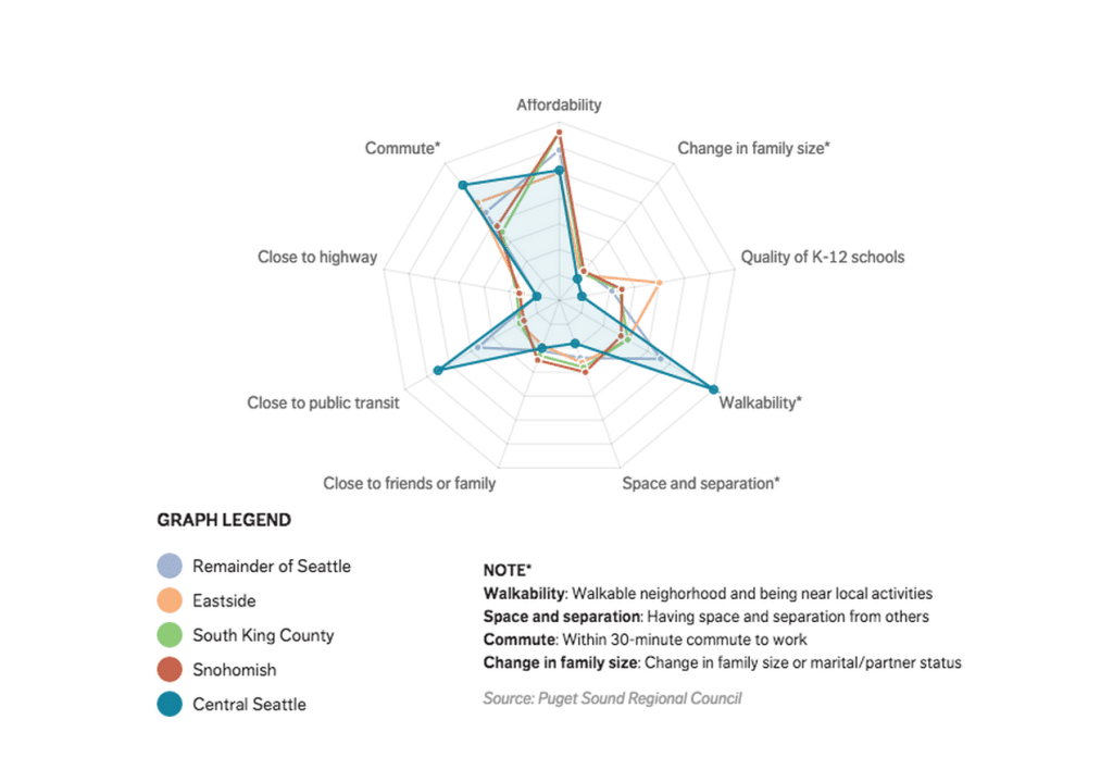
Everyone loves a story, and by adding a human perspective to your data analysis, your clients will be able to relate more and gain a better understanding of how they could benefit from your product or service. Data storytelling allows you to communicate key insights and tailor them for your target market. It helps you be emphasize the information you want and helps ensure it reaches its intended audience.
8. Don’t forget about backgrounds
A website’s background plays a vital role in setting the overall tone. Flat backgrounds are losing popularity, while particle backgrounds are all the rage.
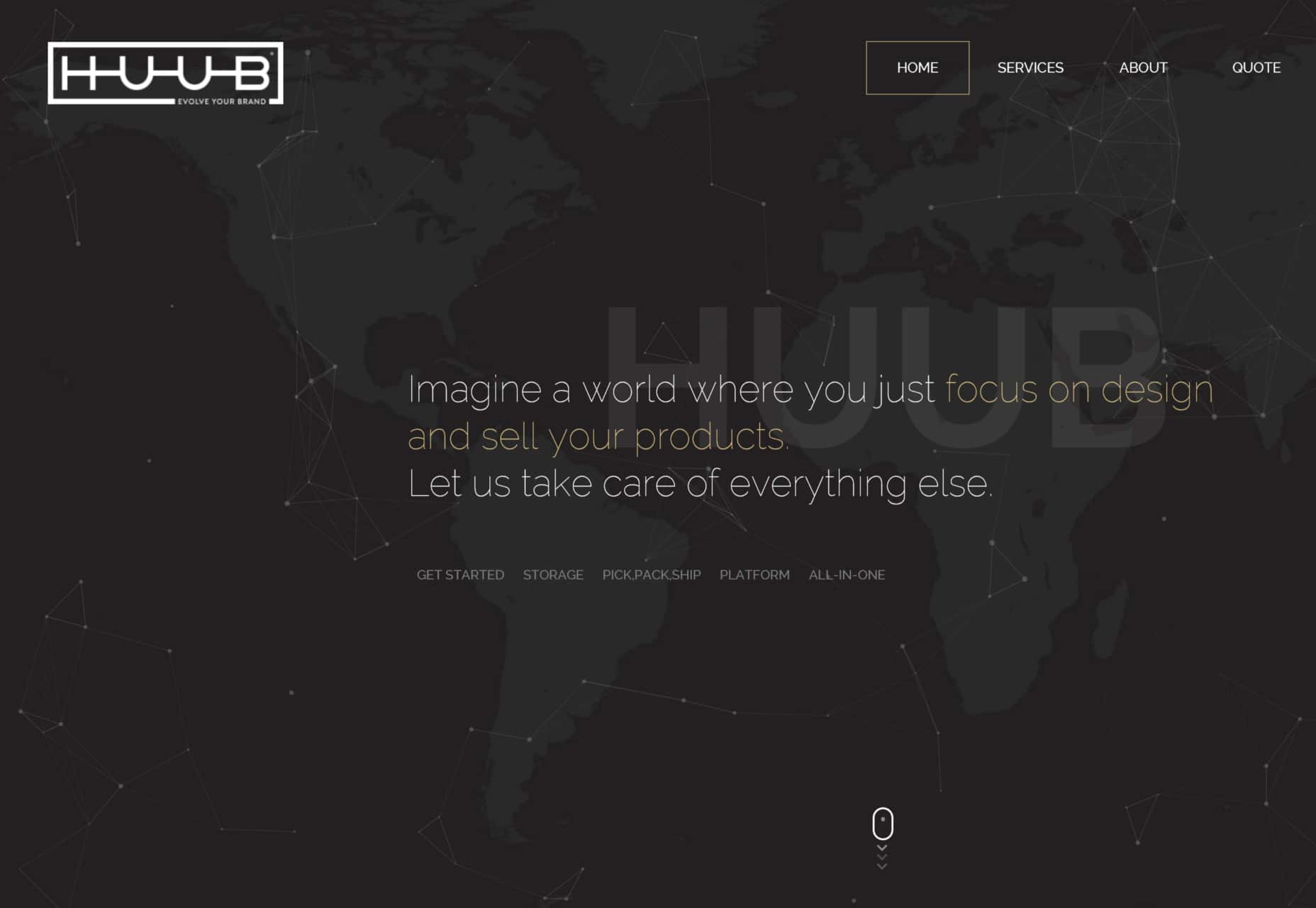
The particles can come in many forms — from little specks to intricate geometric shapes and designs and can either be still or moving. Another popular trend for backgrounds are dynamic gradients. This is a term for two or more colors which blend gradually across the page, creating a striking effect.
9. Provide contact information
Did you know that 64% of readers list contact information as the first thing they look for after landing on a website?
People want to be able to reach a company.
Are your contact details clearly visible?
Are they easy to find on your site?
If not, this would be an easy fix that could bring about very positive results. Providing clear and easily accessible information about your company and how you can be reached also helps build trust and creates a sense of transparency, which are crucial in achieving successful conversions.
Now that you’ve read about some of the latest web design trends, it’s time to put them into practice and let your website work for you!
Craving more? Not to worry, just take a look and bookmark the infographic of web design case studies below!

Infographic URL: https://designadvisor.net/blog/web-design-trends/