The graphic design trends that will dominate 2018
For designers seeking to stay current with upcoming graphic design trends, here’s what you should keep an out for in 2018.

2017 was a glorious year for graphic design and graphic designers. We saw a flood of new trends and a splash of new colors all across the popular and not-so-popular social media platforms. This has brought us to the dusk of the year, and it is time for the grand unveiling. 2018 is awaiting all graphic designers with a flurry of new trends that will hopefully take your breath away.
This is going to be an iconic year for all graphic designers across the world. Almost every vital event, movement and news piece is again likely to get their graphical representations and tributes. We have seen some of the most significant works drive visual identity and powerful associations in the last year. The coming year is not going to be much different, except for a few new trends that Tayloright has picked up.
Here’s a brief glance at some of the most popular upcoming trends of graphic design for the year 2018
![]()
Negative space
There’s nothing negative about negative space. Negative space or white space was tricky and new when it first came back with a bang a couple of years ago. Ever since some of the most reputed brands like Nike and WWF started showing a taste for it in their logos, we have seen a mélange of typographies and designs pop out of the backgrounds.
Double exposure
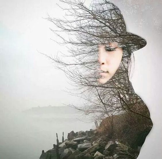
The principle here is a simple one – why settle for one when you can have two? Double exposure is now acquiring a new meaning with an exploration of shapes and forms. From the usage of double lights to the age-old photography influenced techniques, double exposure is not becoming quite ubiquitous to great graphic design ideas. We are expecting to see this effect with a touch of other new trends in the upcoming year in the works of some of the most noted graphic designers once again.
Double exposure duotone
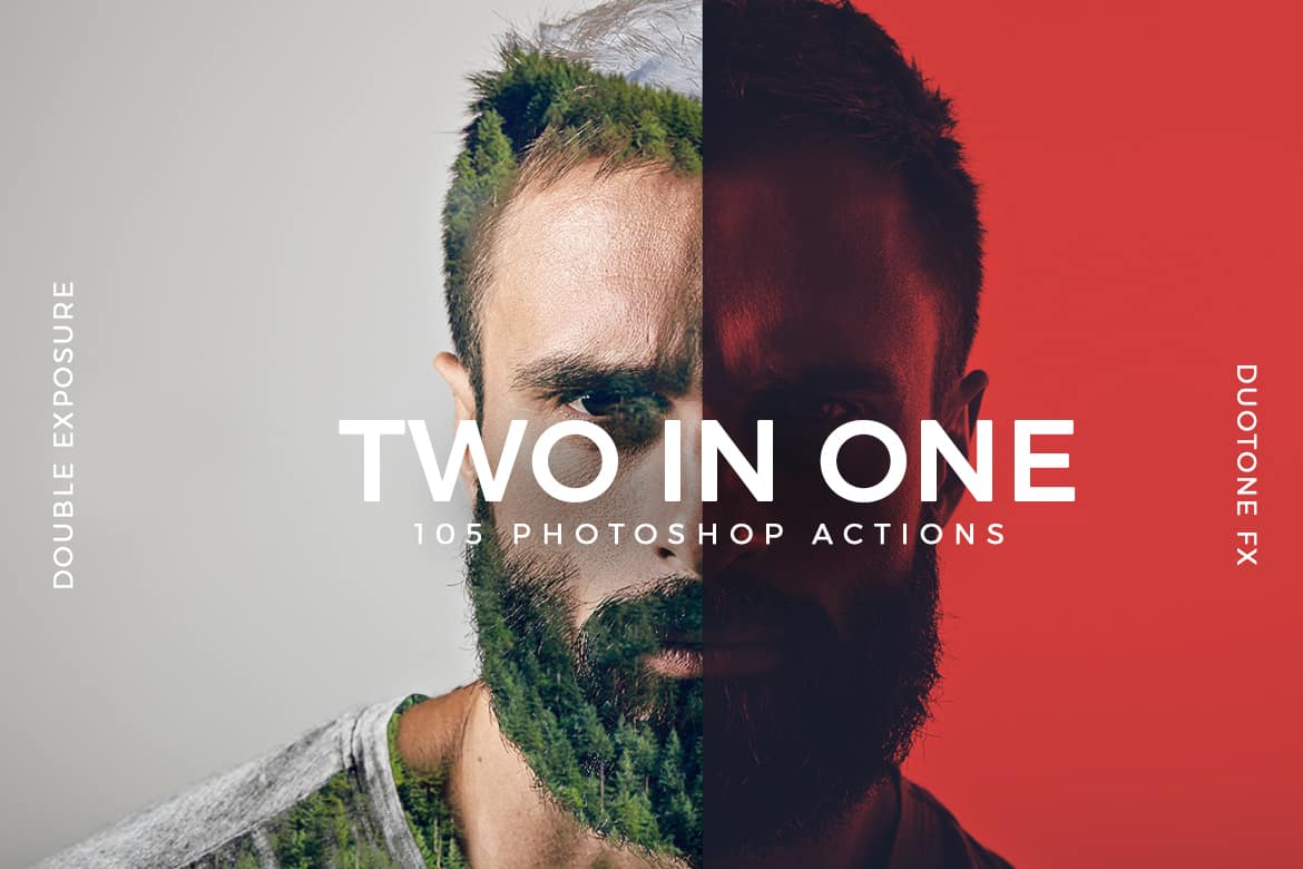
From NatGeo to the best known iconic photographers, everyone is in love with the double exposure duotone. This has a rather sharp contrast effect in place of the soothing blur the usual double exposure offers. The trick is to use two distinct pictures in two separate monochrome colors. Although some aficionados are calling it rather harsh and unbecoming, we think it is quite ahead of its time in every measure.
Double light
When it comes to graphic design trends, this is going to be the year of the double, and that means it is also time for the Double light effect. It has the power to transform simple old portraits into edgy new compositions. It has a distinct 90s hangover, but it is as fresh as it gets thanks to its unashamed use of the monochromatic color splitting. Most trending designers are using two distinct sources of light to achieve this particular effect on screen.
Glitches and scratches
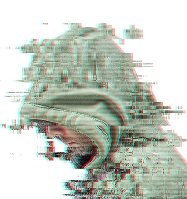
Just like a glitch in the Matrix, a glitch in the designs can be a sign of something really interesting about to happen. It disrupts the perfection of an image and creates a certain human factor in the art. Imagine a picture that is not so perfect after all. The glitch and scratch effects have the power to add a certain dose of nostalgia in some of the most unexpected places. The use of this trend can transform a flashy new design into something comfortable and recognizable. The trending glitch effect is indeed an instant masterpiece creator!
The color channels effect
Some designers are calling it the distorted reality effect, while others are sticking to “color channels” effect. Nonetheless, the posters of the latest Hollywood hits like Flatliners say it all. It is a somewhat trippy effect that creates a sense of visual illusion or hallucination. This is one of the most popular visual effects of late 2017 and its massive impact on the viewers is going to keep the color channels effect on the top of all trends next year as well.
It’s time to say goodbye to a few old trends
On the other hand, the holography trend has already fallen behind, and we do not see it winning this race against color channels. Looks like, holographic designs are not leaving alone. They are taking the classic duotones with them. The classic duotone may have been the hot thing of 2016 and 2017, but we do not expect to see much of it the next year!
2018 is going to be a fun, creative and quite the crazy year for graphic designers. With some of the fantastic typography trends following the visual trends closely, we expect to see the creativity soar.