IS YOUR WEBSITE MOBILE FRIENDLY?
With Search Engines Ranking Websites Based on Mobile Friendly Design ~ It’s Time to Go Responsive!
MAKE SURE YOUR WEBSITE IS MOBILE FRIENDLY & RESPONSIVE
Google gives priority to a website that is mobile friendly. 70% of mobile searches lead to an action within an hour. How much convincing do you need to make sure your website is mobile friendly?
NEED TO MAKE YOUR SITE RESPONSIVE?
WHY ARE RESPONSIVE MOBILE FRIENDLY WEBSITES IMPORTANT?
RECOMMENDED BY GOOGLE
Mobile Friendly Responsive Websites are Recommended by Google
“Pierre Far, Google Webmaster Trends Analyst, announced clear guidelines and recommendations on mobile SEO. In short, Google recommends you go with a responsive design” ~ SearchEngineLand
ELIMINATES ISSUES
Eliminates Duplicate Content Issues With Mobile Templates
“For SEO value, Google’s Matt Cutts states responsive design is the smarter way to go for SEO, primarily because you can have issues when creating a mobile version of the page if you aren’t implementing it correctly.” ~ SearchEngineWatch
REDUCES BOUNCE RATE
Eliminates Duplicate Content Issues With Mobile Templates
“A responsive web design will rearrange content as per the medium and will cause no horizontal scrolling and eventually your ratings may go up in Google’s list and you will get the maximum effectiveness out of your SEO.” ~ WebsiteMagazine
So, Is Your Website Mobile Friendly?
Help your business overcome key marketing hurdles by defining your value, messaging and creating motivation in your customer base.
Google Mobile Friendly Test
Test Your Site Now!
Is Your Website Mobile Friendly?
Based on internet user research, if your site doesn’t work on a mobile device people will simply stop visiting it in favor of a site that provides a smooth mobile friendly user experience. In fact,
Google says 61% of users are unlikely to return to a mobile site they had trouble accessing and 40% visit a competitor’s site instead.
Is Your Website Responsive?
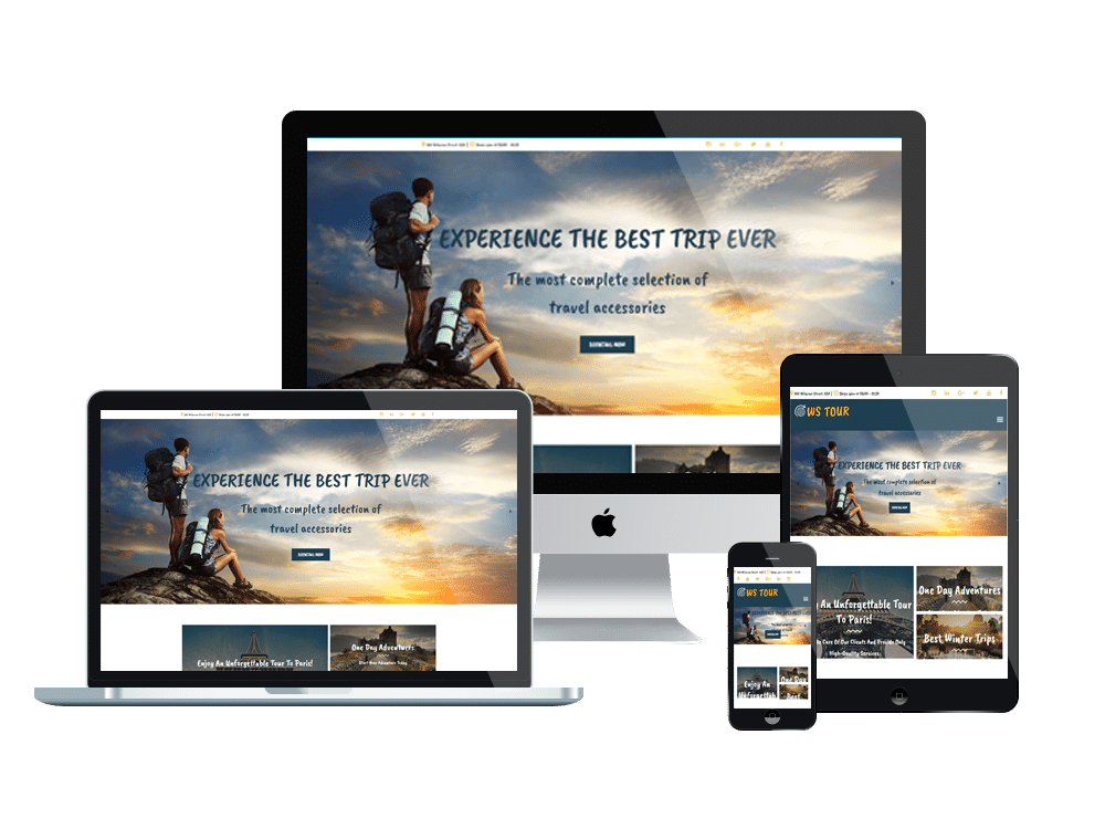
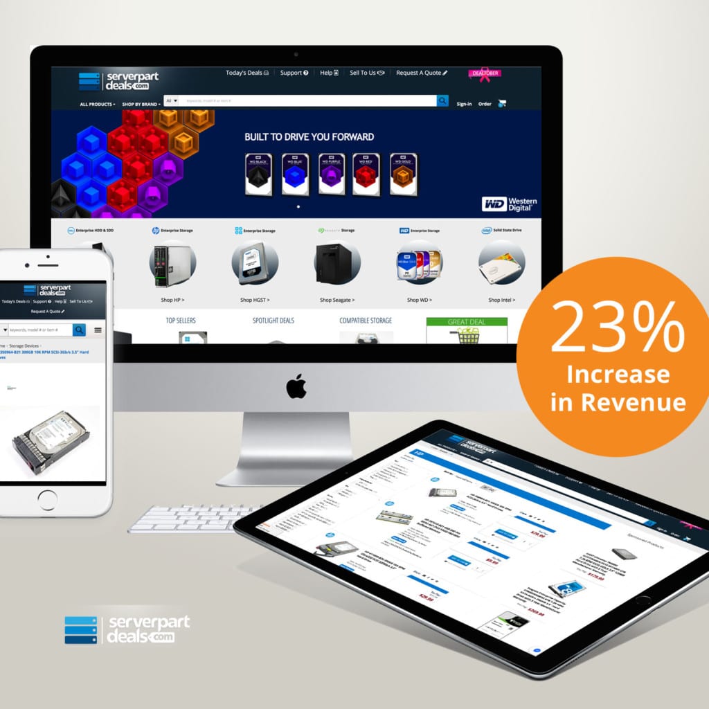
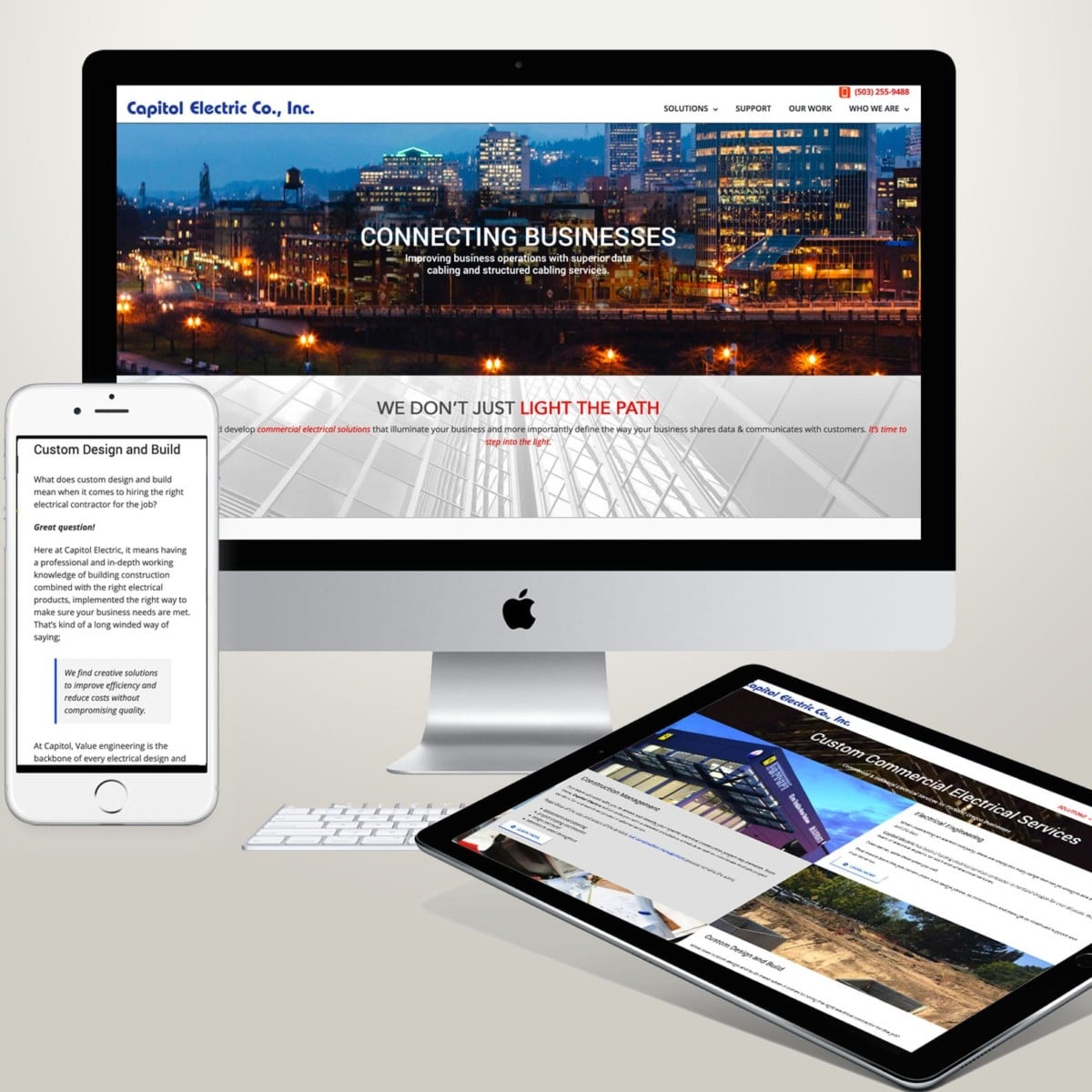
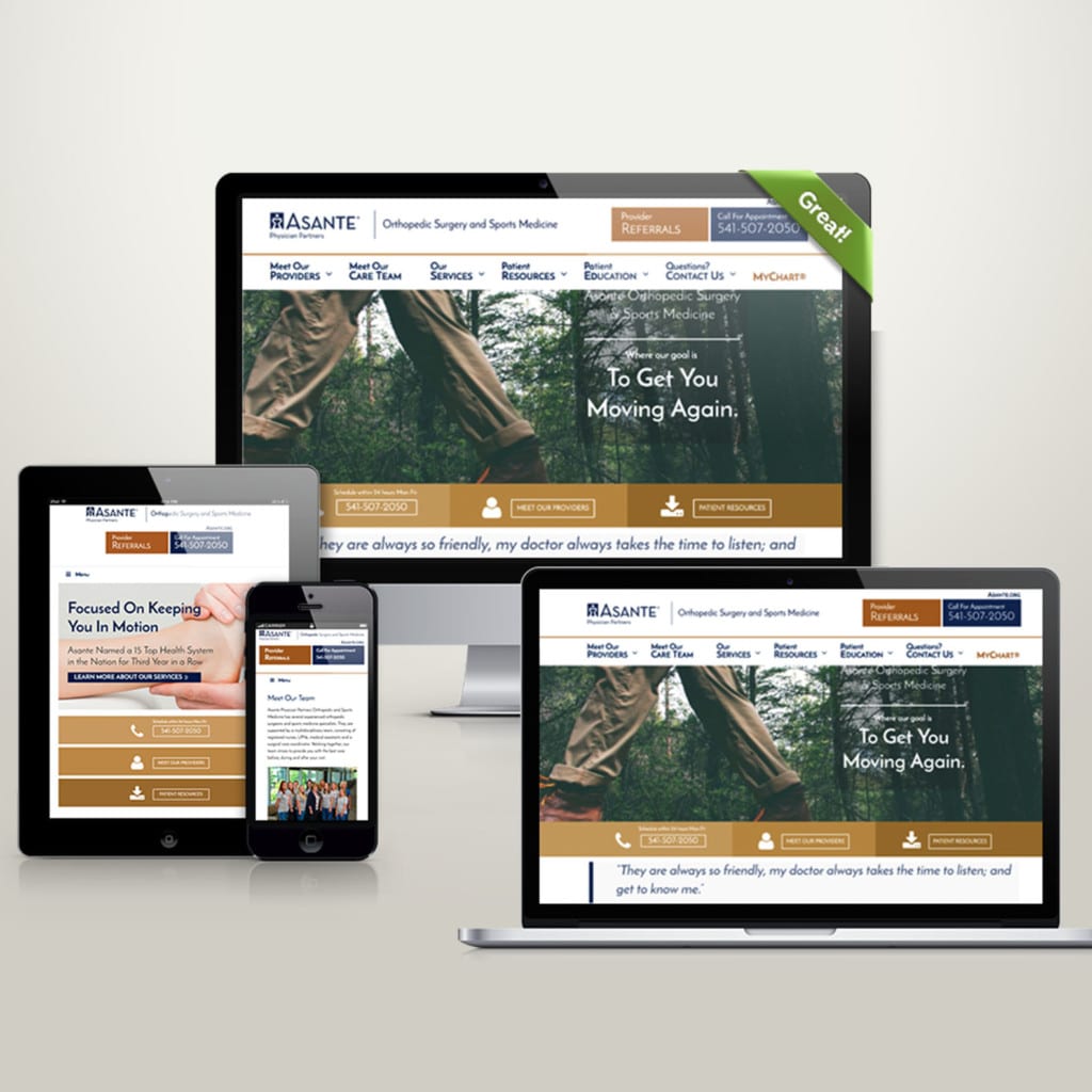
The idea of responsive design is that the same website will look great using the same theme while you’re browsing the web on your phone and on your computer without sacrificing any of the quality or ease of navigation. So, whether you’re using a personal laptop, a notebook computer, or you phone, you can access the same website on all of them without losing quality.
Responsive Site Checker
Test Your Site Now!
Whether Your Site is Mobile Friendly or Not Directly Impacts SEO
Google looks at hundreds of ranking signals when deciding how to rank your website on search engines and mobile usability is currently the third most important of all these factors. Google is taking a very proactive approach when it comes to mobile friendly web design and recently declared that it would crawl and index the mobile version of websites before the desktop version.
Furthermore, Google is going to start using ranking signals from the mobile version of your website, not the desktop version. If your website it NOT mobile friendly this will most certainly affect your rankings in Google.
We focus on responsive website to achieve the best mobile friendly experience. What this means is that any specific web page uses the same URL and the same code whether the user is on a desktop computer, tablet, or mobile phone – only the display adjusts or “responds” according to the screen size.
Google recommends using responsive web design over other mobile templates. There are some pretty big benefits of using responsive web design to create a mobile friendly site one of them being that you’ll only need to maintain one version of your site instead of two (i.e., you won’t need to maintain the desktop site at www.example.com and the mobile version at m.example.com – you’ll maintain only one site, such as www.example.com, for desktop and mobile visitors).
HOW TO MAKE YOUR WEBSITE MOBILE FRIENDLY
Mobile Friendly Means Focusing on Size – Device Size, Font Size, Image Size and Size of CTA’s
MOBILE FRIENDLY
Responsive web design!
If your website isn’t mobile friendly, this is a great opportunity for you to optimize your message delivery and really think through the best way that your customers can navigate your content on any device.
Identifying your goals is essential to designing a successful mobile friendly website. How else can you determine who you are selling to and what actions should be taken to not only reach your customers, but to convert them into sales? Creating successful goals when converting your site to a responsive web design should focus on the following core elements:
LET’S GET MOBILE FRIENDLY
Faster Load Times
One of the main advantages of mobile first design is faster loading times across all devices.
Better User Experience
Increased responsiveness found with mobile first will improve the overall user experience, as well as navigation.
Touch Friendly Design
With smaller screens, buttons, text, images and sliders must be optimized to each specific devices proportions. In short, it has to be easy for me to read and easy for my big clumsy fingers to navigate call to actions.
Font Based Icons
Higher pixel densities and resolutions on high resolution screens of tablets can make certain graphics look pixelated. We Use font-based icons to solve this issue.
SUMMARY
of a Responsive Website
Flows to All Devices Fluidly •
Loads quickly on any device •
Uses a large, easily readable font •
NO use pop-ups, floating share buttons, etc. •
Devote limited screen space to useful content •
Need Help With Responsive Design?
Get a Quote on Making Your Website Responsive.
Click Here
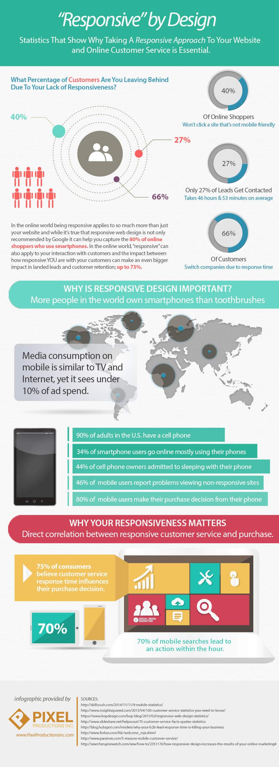
INFOGRAPHIC RESPONSIVE BY DESIGN
How Our Graphic Design Team Works to Meet Your Needs!