UX Trends You Should Be Implementing on Landing Pages
There are a LOT of posts about UX Trends, but this post provides insight on UX trends that are fundamental to the success of your website’s landing pages.
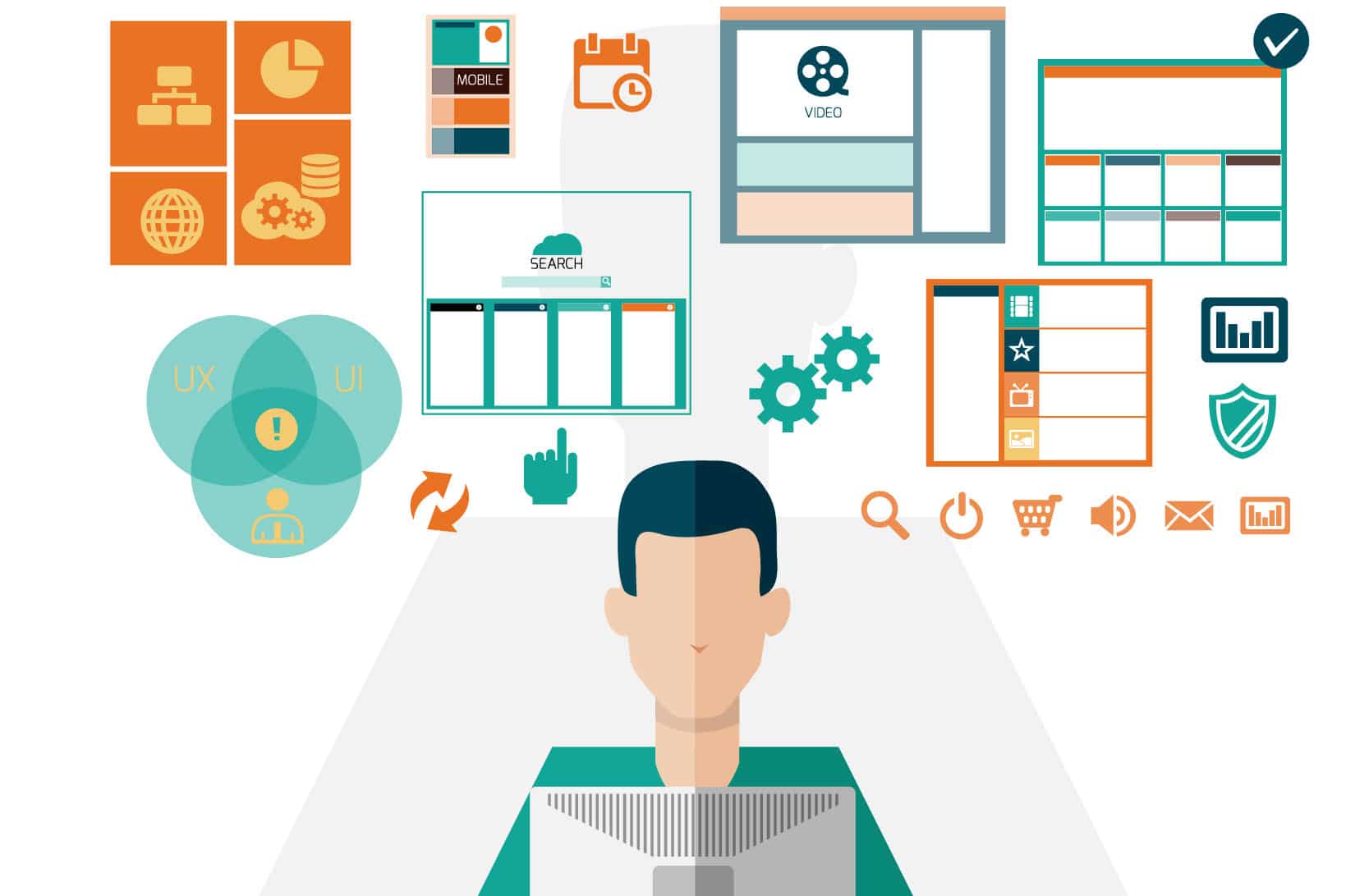 image by: https://www.freepik.com/free-photos-vectors/business
Every person that’s ever used the Internet is well aware of the frustration of landing on the wrong page, or one that is counter-intuitive.
The path of a user must be designed, so that fits the right scenario. To optimize your site in accordance with your expectations and the user’s comfort, you need a skilled UX designer.
A seasoned user experience professional can combine the aesthetic side of design and turn it into a coherent story for the person visiting the said landing page. All the recent UX trends are aimed at minimizing the pain points between a website’s interface and the user’s decision-making.
Before you add anything
When you’re designing a landing page, you need to take care of one fundamental task —to satisfy the people’s expectations. A user whose expectations are fully met is the one that most likely converts. Help them convert by removing as much friction as possible.
UX is about killing all distractions and helping the user gently slide to the object of his interest on your website. Before you get too caught up in UX trends, start by removing as much as necessary to focus on the essential elements.

White space (also known as “negative space”) is an effective option to focus users’ attention on the core elements of your landing page.
Quip Oral Care is a pretty stunning example of using white space to really focus the users’ attention on the product.
Some managers consider negative space as a wasted opportunity to put more content for the sake of product promotion or SEO optimization. However, using it wisely gives a feeling of elegance and ensures a quality user experience.
Focus on the offer, don’t overload the user

After you’ve eliminated a large number of distractors, you mustn’t overwhelm the user with the offer that you’re about to present him with. Introduce the product slowly but create a hierarchy of qualities that transition slowly one into another.
You may follow this scenario:
- introduce the product, provide the user with some general information
- describe the problem that the product solves
- provide the user with information on why this product is to be trusted
- a clever/strong call to action
Too much information is always harmful to conversion. In the world of User Experience Design, less is always more.
The right call-to-action button is your strongest tool to convince viewers to make the final decision and order goods or services on your website rather than go somewhere else. It should be noticeable and using proper color contrast to make your visitors act.
The text is part of the design

The need to ensure a low-friction interface has created the desperate need for a new type of writing — UX writing. Words don’t have to be exquisite and clever, they need to help the user use a website with maximum comfort and ease.
The main idea of modern UX writing is to guide users within a website and help them interact with it correctly. There are no irrelevant things here. Everything – from buttons, menu labels to error messages and instructions – must contribute to the compelling user experience. Good user experience not only improves the chances of converting visitors into loyal customers but also is one of the important rank factors in SEO.
There are now numerous tools and services you can use to ensure that your text interacts with the design correctly.
- Natural Reader — since a “natural” text is essential in an interface that is consistent with the latest UX trends, it’s essential that you hear texts read back to you. This way you can judge how well you’ve written it. Natural Reader is an excellent solution to that problem.
- Canada Writers — it is often the case that you need to look for writers that are versed in particular niches and know how to localize a text well. Canada-Writers is a site that collects reviews for writers located in… you guessed it.
- Figma — this is a tool that intends to replace Photoshop and Illustrator. It’s more powerful, offers more technical opportunities, and it’s cloud-based.
- GetGoodGrade — A resource that focuses on collecting reviews for different niche writers, so you don’t have to gamble when hiring a new one.
- Zeplin — this is an impressive new tool that makes collaboration between designers and developers much more comfortable and decreases delivery time.
Engaging and attractive scroll animation
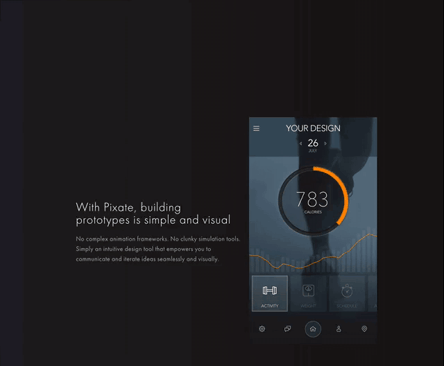
Despite the fact that there is a large number of people who consider video a useless distractor that makes the interface too dense and is problematic for conversion, many users find animated landing pages enjoyable. When done properly, animation can impress a potential customer, and increase the conversion rate.
“A well-executed video animation can “awaken” a boring landing page and stimulate the user into using your services. These positive emotions related to the animation are then associated with your brand,” says Emily Saunderson, lead designer at Best Writers Canada.
When it comes to UX Trends like this, there are, however, some basic rules to remember if you don’t want to turn your landing page into a mess of different animations that just don’t stick well together. Your animation has to be clean and smooth. It shouldn’t distract users from the content of the page.
Use user-friendly forms

You need to invest a lot of time in getting the forms right.
Since this is one of the most important elements of the site, where you’ll be collecting information from your users, you’ll have to A/B test the hell out of it. The shape and color of your forms matter – just make sure you keep them tidy and uncluttered and get to the point ASAP.
The better you design your forms, the more information you’ll receive from your user. This is the main reason why a well-executed form will drastically increase your conversion ratios. A good user form convinces users to share their information with you. Later, you can use this data to make your marketing efforts more precise and effective. Another option to provide visitors with additional information is to add a chatbot to your landing page. It can answer the most common questions and collect contact information.
So, it turns out, a little investment in a single contact form can improve your revenues. And it applies to all the small details when we talk about user experience. All elements are interconnected and play their role in how visitors act on your landing page.
Conclusion
If you’re looking to increase your sales, you need to invest a considerable amount of time and money to hire a UX or SEO copywriter that will be able to minimize the friction factors between your end user and your website. The lack of friction will allow your customer to “slide” right into the product description, without being distracted.
Make sure you focus on the text since it is a vital instrument in building an intelligible design. Help the text shine by adding some video in the midst of it. And last but not least, combine the power of text and impeccable design by creating well-executed and compelling forms to collect data from your users.
Once you implement these principles, you’ll end up with a well-converting landing page.