11 Examples of How Illustrations Can Skyrocket Blog Engagement
4.4 Million blog posts are published daily – you need every advantage. See how illustrations skyrocket blog engagement.

Human illustration vector created by freepik – www.freepik.com
How often have you come across a blog post and committed to reading it entirely?
Not many, I see. I don’t blame you either. The internet is too vast, and high-quality content isn’t. A weird paradox of the digital age. You see, the thing about engaging content (blogs in this case) is that it requires attention to different aspects, visual illustrations being a major one.
I can’t tell you the number of times I’ve been baited into clicking on a blog post solely for its feature image.
However, a featured image won’t be good on its own to keep an audience hooked for long. A constant stream of illustrations in every other heading into a blog post although, would go a long way to getting the job done. Whether you’re a creative design-based firm or a busy digital marketing agency, illustrations are important for every sector.
Now, why am I suggesting illustrations like a maniac over and over again? Two simple reasons:
- Not everyone’s a fan of reading plain text.
- Images are a free ticket to get you better rankings on Google.
I know all talk isn’t going to get me anywhere, so here you are; let’s glance at 11 great examples of how illustrations have taken blogs to the next level.
#1 E‑Commerce Time‑Savers By Mailchimp
MailChimp is one of the well-known marketing firms. Even if you’re unaware of their services, chances are you’ve seen their mascot, the iconic chimp ‘Freddie.’ Part of the reason why MailChimp is widely known is their unique ways of using illustrations.
While Freddie and the bright yellow background is good on its own, MailChimp did not disappoint when it came to one of their write-ups either.
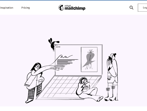
The illustration depicts how every person has the ease of shopping online, saving up on time and effort to visit retailers.
#2 How to Choose A Bed Frame By Casper
This one caught my eye due to its calm ambiance. One thing to know about Casper is that if they’re not making a mattress, they’re busy learning about different things related to either resting or beds. I’m not against that hobby of theirs; I’ll tell you that. But, coming to the main point, their illustrations on blogs are pretty straightforward to understand.

The way different factors are shown in this illustration is clear, concise and attractive.
#3 Keyword research for SEO: The Ultimate guide by Yoast
If you’ve ever tried learning SEO at some point in time, you will be familiar with the word ‘keyword research.’ In one of Yoast’s blogs for keyword research, they unlocked a simple rule, ‘simple consumable content is an effective way to grab users’ attention.’
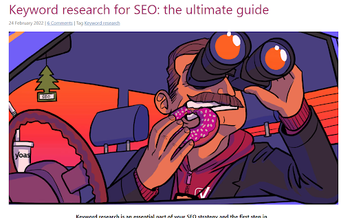
Know the best part about this illustration? It covers everything! Whether it be the research aspect, SEO or even Yoast as a brand! You have it all in one image.
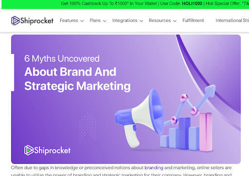
#4 Six Myths Uncovered About Brand & Strategic Marketing By ShipRocket
ShipRocket isn’t a digital marketing agency, but boy does it sure know the ins and outs of it. In one of their blogs, where they debunk myths related to brand marketing, they use a 3D illustration to get the initial point across. I also like how they stuck to their brand’s purple color code on this illustration. While there is space for more elements, this illustration gives room for breathing.
#5 How to Use Ahrefs Backlinks Checker for Link Building by Startup Voyager
If you try to cramp too many things into one single illustration, you may end up with a disaster. Spacing between elements within an illustration is essential. This is precisely what Startup Voyager proved in one of the feature images of their blogs.
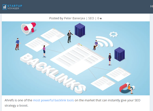
The blog was about using the platform Ahrefs for backlinking, and the feature image stole it away! Beginners can get a simple idea that backlinks direct you to other pages; however, the curiosity as to what role Ahrefs plays remains!
#6 Drone Laws by Country(Complete Map for 2020) By Drones of Gator
The platform Drones of Gator too has one of the most unique illustrations I’ve come across. If you’re a drone fanatic, then this site may very well become your favorite. Coming to point however, in one of their write-ups, Drones of Gator displayed the different laws set for drones across the globe.
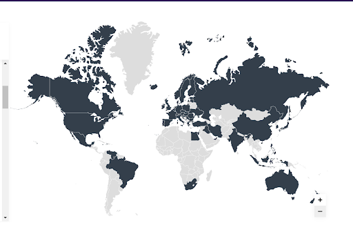
Their main selling point is this part right here.
Try putting your cursor on any state, and it’ll show its name; click, and it’ll display further details in a separate page. Drones of Gator have uploaded a good amount of blogs already and they could’ve given this topic the same treatment. However, they were able to innovate a smart and well-thought design, allowing readers to digest content easily with fun.
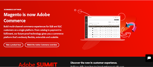
#7 Magento is now Adobe Commerce By Adobe Commerce
If you’ve got an established brand already, you can do what Magento (Now Adobe Commerce) does- create modest illustrations to get the point across. While this illustration doesn’t come from their blog, it was worth mentioning either way due to the subtleness in the design.
#8 What Is Salesforce? By Salesforce
Explaining your product/service is essential. Salesforce nailed it when it came to their introductory blog. The illustration itself displayed one of the brand’s mascots Astro! While I’m not sure what kind of animal Astro is (and after tons of researching, I’ve decided to give up on knowing it too), I love that Salesforce has a different character for every aspect of its brand.
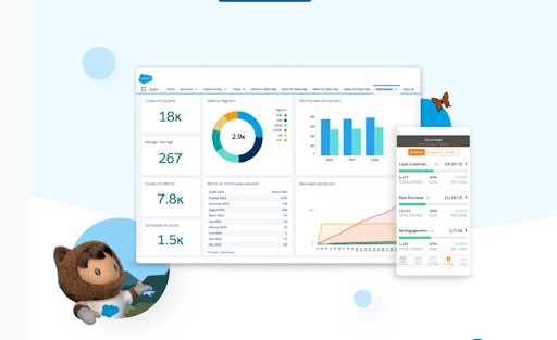
This illustration served to be the optimal choice, displaying the Salesforce platform on multiple types of devices with Astro at the bottom, presenting it.
#9 Managing Rogue Communications In the Financial Services Sector By Slack
We can’t talk about illustrations and not include Slack. Fun fact, Slack was where it all started. No, they didn’t create the first illustration in existence. Still, it is thanks to them that every other organization decided to use modern illustrations for their landing pages and blogs. One of their recent blogs showed why they are one of the oldest players in the game.
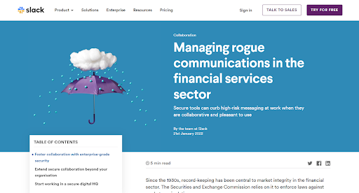
This illustration of theirs was a beautiful personification of how Slack (the umbrella) manages the hassles of communication in the sector of financial services.
#10 Headspace
Okay, this may not be the most impressive example of using an illustration, but it does pack a punch. Why? It’s modest. You see, Headspace blogs have gotten a lot to do with optimism and mindfulness. If you’re feeling down, you might not want to bother with detailing in design as a reader.
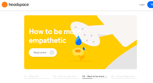
Headspace’s minimal illustrations are catered towards their specific target audience.This is why mentioning it is crucial. If you’re taking the leap to hire an illustrator or making one yourself, ensure that the design complements your target audience and is of their interest.
#11. A Step-by-Step Guide to Writing a Compelling Article Introduction by Quicksprout
In case you haven’t heard, infographics are way more potent than what we know. Quicksprout has given everyone a great example of how you should use infographics. Here’s an illustration of one of their blogs that guide the reader into writing the best intro for articles.
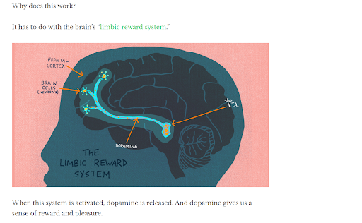
The article’s main point was to explain how certain words put together can ‘reward’ the brain. If they kept an actual detailed view of the brain, no one would be interested in the least.
Try keeping fewer than adequate details, and the audience won’t visually understand their point. Quicksprout sure activated our ‘reward’ system in this blog. They found the fine line between too much and too little in design.
This picture highlights the limbic reward system, which they mention while the rest of the brain is displayed usually. The simple, cartoonish, and yet detailed infographic is what satisfies visual learners.
Conclusion
In a nutshell, an SEO-optimized blog or high content quality articles may help you build an audience, but adding illustrations can boost your chances of reaching them. Moreover, users prefer to click on visually engaging digital content in today’s era. However, the primary thing is to make sure there is no overuse of illustrations as it can make an article seem like a mess. Instead of this, smartly integrate infographics, portraits, graphs, or any other visual representation whenever there’s a need for one.