Mobile SEO: How to Ensure Your Site is Mobile-friendly
By now, everyone knows their site needs to be mobile friendly, but what should we be paying attention to to ensure that our sites meet the necessary mobile ranking criteria?
Google says there are now more searches using mobile devices than on desktops, including laptops. And last April, with its “Mobilegeddon” deadline, Google forced us to ensure that our websites were mobile-friendly.
We know our website needs to adapt to a mobile environment, but how do we make sure it complies? What are the mobile ranking factors to which we need to pay attention?
Check for Mobile-friendliness; 4 Ways
First, let’s check to see if your website is already mobile-friendly, according to Google’s standards. (If it is, then you can spend more of your time working on mobile search engine ranking factors, as outlined below.)
Google Search. The easiest way to check is to search for your company name or domain name in Google using an iOS or Android device. Look at your search engine listing. If it says “mobile-friendly,” then you’re in good shape.

Google Search Console. Verify your website in the Google Search Console (formerly Google Webmaster Tools). Look in the “Messages” section. If you haven’t deleted your messages, it’s likely that Google notified you, in the event your site isn’t mobile-friendly.
The new tool is linked from Search Console’s mobile usability report or available directly at https://search.google.com/search-console/mobile-friendly
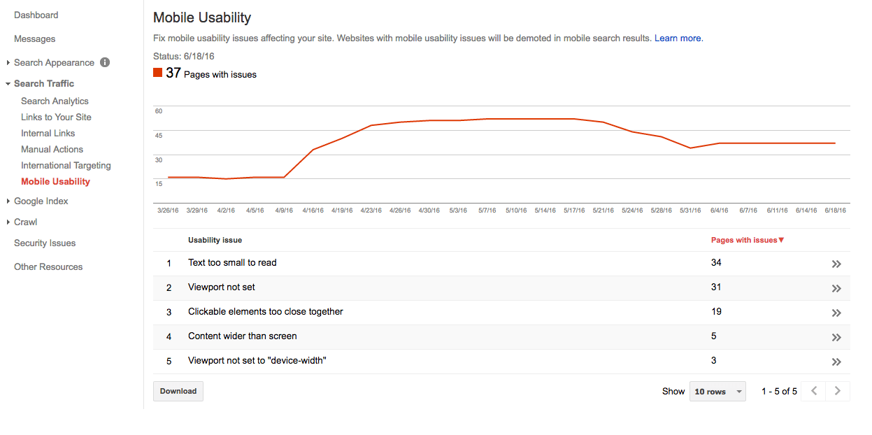
In Search Console, there is a “Mobile Usability” section found under “Search Traffic.” This section will show you errors and issues if there are any.
Google Analytics. You can use Google Analytics to see the mobile traffic to your website. Once in Google Analytics, click on “Audience,” then “Mobile,” and then “Overview.”

In the above example, you can easily see that visitors from desktops comprise about 80 percent of the site’s traffic. Only 16 percent use mobile.
Look at how your site fares, to see if mobile traffic is a concern. In our example, less than 20 percent of visitors use mobile devices, so spending a lot of time appealing to mobile users may not make sense. If more than 30 percent of your site’s traffic comes from mobile, however, allocate some time to optimize it for mobile visitors, to help it rank better in mobile search results.
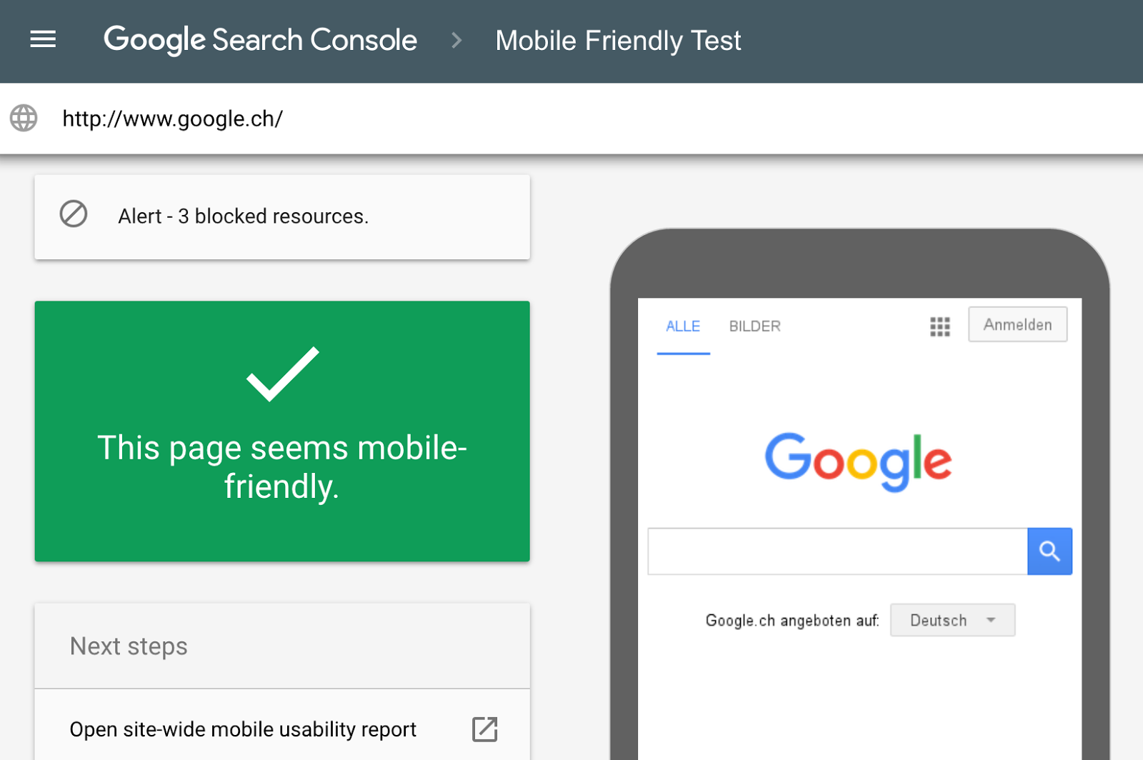
Google’s Mobile-friendly Test. A final way to check your website for mobile-friendliness is to use Google’s Mobile-Friendly Test tool.
In the following example, I checked Web Marketing Today’s site to see if it’s mobile friendly — and it is.
If the page is not mobile-friendly according to the test tool, Google will walk you through the steps needed to start the process.

If the site isn’t mobile-friendly, and you don’t want to (or can’t) redesign it right now, you are not without hope. Keep your current website as is, but create a separate, mobile-optimized version, and then add code to your site that redirects mobile visitors to it. Be aware, however, that you will need to maintain two different versions of the site.
Here are two ways to create a mobile version of your site:
- Use a service like DudaMobile, bMobilized, or MobilizeToday;
- Set up a separate website using a CMS such as WordPress or Joomla, and choose a mobile-friendly theme.
Out-of-the-box services such as DudaMobile are much quicker to get up and running but involve a fee. You may be able to install WordPress on your current website, to save money. If so, set it up on a subdomain, such as m.yourdomain.com. You will need to provide content and customize the theme, which takes time.
Mobile Search Engine Ranking Factors
Obviously, the first mobile search engine ranking factor we all have to get past is having a mobile-friendly website. That said, there are specific search engine ranking factors that will help your mobile site rank better in search results. Here is a list, not necessarily in order of importance:
- Overall mobile usability. How easy is it for visitors using a mobile device to navigate around your site;
- Schema.org markup. With the search engines’ ability to see your location based on geo-location data from your smartphone, mark up the site with schema.org code, which helps search engines return more informative results;
- Verified local listings. Claim and verify your Google My Business listing for each business location;
- Local citations. Services such as Yext, Moz Local, or Bright Local can help you claim and add the proper business profile and NAP (Name, Address, Phone) data to multiple local citation sources, including Yahoo Local, Bing Local, Yelp, Foursquare, and others;
- Links are still important. Having links and listings on local area websites is key. Listings on the Better Business Bureau, chamber of commerce, and even local newspaper sites can help establish a local online presence.
Many of the other mobile search engine ranking factors are similar to what we look for in a well-optimized website: good navigational structure, unique content, and links from other sites. If your site ranks well in organic search, then making it mobile-friendly will help it rank well in mobile search results, too.
This post, Mobile SEO: How to Ensure Your Site is Mobile-friendly, was first published on WebMarketingToday.