The Importance of a Mobile First Design for Your Site
We’ve become more mobile these days, using our phones for everything, especially online searches. Read on for why you need a mobile first design for your site.

The Importance of a Mobile First Design for Your Site
Your website is a portal through which you convey your message.
Whether the goal of your message is to provide news, an opinion, a service, or a product, website design can make or break a business.
Web design trends may come and go (does anybody remember the ‘under construction’ signs in the internet’s early days?), some prove their worth and become standards.
And now, with the continued proliferation of mobile technology, web design has come to a new focus in what’s known as mobile first design.
Mobile first design isn’t just another fad or a buzzword.
It’s becoming an increasingly important aspect of how websites are made, which is born out of how they’re being used.
In this post, we’ll discuss what mobile first design is, why it’s important and more.
What is Mobile First Design?
In terms of website design, a mobile first design is exactly what the name implies.
The concept recognizes that more and more people are viewing web content on their personal mobile devices.
Before the widespread use of mobile web browsing technology, websites were designed with the user experience catered to desktop viewing. As a result, mobile viewing was placed on the back burner.
But now that more people are viewing websites on mobile phones, the user experience needs to accommodate the different types of platforms used (i.e. mobile, tablet, and personal computer).
The user experience places the emphasis first and foremost of mobile usability.
That is, mobile first allows users to easily view text, images, and menu options because the user experience was designed specifically for this mobile platform.
Also worth noting is that with this new concept comes new design tools.
Web designers are now able to instruct websites to automatically read what kind of device it’s being used on and adjust its pages accordingly.
For example, when viewing this type of site on a mobile phone, the text will adjust to optimize viewing on a small screen.
If the website is accessed on a desktop computer, the website will accommodate for the larger screen space, as well as for the differing input methods, such as using a keyboard and mouse instead of touch.
Why You Should Use It
The use of mobile devices to access websites is quickly approaching the new norm.
More and more people are viewing websites on mobile phones, and the networks that carry the data are becoming faster and more reliable across the globe.
In terms of creating an effective and successful brand, considering the use of mobile first design is that much more crucial.
Furthermore, search engines such as Google have already started accounting for mobile user experience when determining a webpage’s search results page rank.
With more traffic being delivered to websites via mobile devices, implementing a mobile first strategy could prove hugely beneficial to both a growing and an established company alike.
But despite the obvious benefits of the design, it still has its pros and cons.
Advantages
One of the main advantages of mobile first design is faster loading times across all devices. And in respects to SEO strategy, this is huge as it ensures Google won’t penalize your pages for being unresponsive.
Additionally, the increased responsiveness found with mobile first will improve the overall user experience, as well as navigation.
Furthermore, the foundation of website design is built from the mobile device up.
That is, a site’s functionality is built for viewing on a small screen, but making additions to enhance the experience on larger screens will require relatively minor additions to the site design.
Disadvantages
The main disadvantage of a mobile first strategy is its limitations in regards to screen space.
While this might make elegant and artful designs more difficult, it forces the designer to keep it simple.
Depending on your target audience, this might require some additional legwork when ensuring that desktop viewing is as clean and functional as mobile viewing.
Web Design Differences
Not all websites are created equal.
Think of your favorite websites. What qualities do they have that distinguishes them from the rest?
Are they easy to navigate? Does the web page content load quickly? What’s the user experience like overall?
Now, take a look at your own website. Examine which qualities it has to keep users not only on the page but also coming back for more.
Mobile first design is one of the latest concepts to come into the foray of web design as it pertains to search engine optimization (SEO).
Though, there are other similar terms and concepts used to describe similar but different elements of
Though, there are other similar terms and concepts used to describe concepts and strategies which might appear to be the same as mobile first but are actually slightly different. Let’s take a look:
Mobile Friendly
Mobile friendly design is a term used to describe websites which allows for much of the same functionality on mobile devices as found when viewing on a desktop.
For example, if the site is viewed on a desktop and features large horizontal images, the site may accommodate to mobile viewing by arranging the images vertically and resizing them.
However, some of the functionality found when viewing on a desktop may be lost when using a mobile device.
Responsive
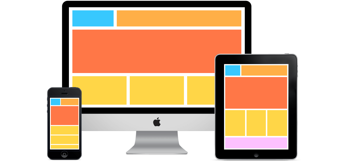
Responsive web design refers to functionality that is meant to cater to a variety of screen sizes, as well as screen orientation.
The objective of this design strategy is to offer the best viewing experience for every user no matter what type of device they use, whether it be a desktop, tablet, or mobile.
When compared to mobile friendly design, responsive places more priority on the initial design while mobile friendly is sometimes considered as a second thought in the building process.

Mobile First
As previously discussed, mobile first design places the design emphasis primarily on users viewing websites on small screens.
Mobile first design differs from mobile friendly in that small screen viewing is the primary consideration rather than secondary.
It also differs from responsive design in that optimal viewing for small screens take precedence over all other screen sizes.
While the differences may seem slight, they are important to consider when expanding and revamping web design strategy.
What Now?
Whether you have a website up and running, or are just in the beginning stages, mobile first is a web development strategy that’s here to stay.
More people are using mobile devices throughout the world, so why not accommodate them?