7 Characteristics of High-Converting CTA Buttons (With 5 Great Examples)
There are call-to-actions and then there are calls-to-action, learn what makes high-converting CTA buttons different with these awesome examples.

Source: depositphotos.com
Conversions are the bread and butter of most websites. Whether you are tracking clicks, sales, or lead captures, you want to know how many of your visitors are performing the actions you want them to perform.
One of the best conversion-boosting elements of a website is the CTA button. But sadly, many websites use them rather poorly or not at all.
Let’s examine the importance of CTA buttons first, and then we’ll take a look at five great examples to inspire your next CTA design.
The Importance of CTAs
Research has shown that more than 90% of website visitors who read your headline will also read your CTA. This means that your audience is already familiar with the call to action and what its purpose is, and will want to see what you are offering on any given page.
Back in 2013, it was estimated that 70% of small business websites didn’t have a CTA at all. These numbers have likely changed a lot since then. After all, how many websites without a CTA can you find now? Unfortunately still, there is no recent data to confirm this assumption.
However, even if only 20% of your competition is operating sans CTA, you can beat them with the clever use of yours.
1. Make It Pop
The first rule of good CTA design is rather simple: make it noticeable.
You will come across a lot of websites that blend their CTAs with the rest of the page. And while this does make for a more smooth page design, it does not serve our conversion-centric purpose.
For a CTA to work, it needs to be easily distinguishable from the rest of the page. The simplest way to achieve this contrast is to use a color that contrasts with the rest of the page.
SAP has found that orange is the best color for CTAs, as it has boosted their conversion rates by over 30%. This is what Transparent Labs does as well. Their CTAs are orange on a white background, so there is absolutely no mistaking them.

Source: transparentlabs.com
2. Speak to the Visitor
The way you word your CTAs is also incredibly important. While you most often see those very generic solutions, along the lines of “buy now,” “sign up,” etc., just a little bit of creativity can go a very long way.
Ideally, you want to make sure you speak the language of your target audience. If your brand is known for its wit, your CTA should demonstrate that as well. If you are known for your sophisticated products, speak that smooth lingo in your CTAs too.
Something as simple as speaking directly to your visitors can also go a long way. Instead of saying “sign up,” try using a “sign me up” CTA button. NMC CAT does this very well in their footer, with a simple yet effective pop of yellow.

Source: nmccat.com
3. Offer Different Conversion Paths
Every page will have a main CTA. On product pages, for example, that will be the “add to cart” button. In a blog post, the main CTA might be an email signup one.
While separating these two actions is okay, you should always try to feature more than one conversion path (i.e., more than one kind of CTA) on every page. Even if it’s a blog post, try to offer a path for purchasing a product from there. Or, direct traffic to another blog post that already features a sales-oriented CTA.
By placing a newsletter signup CTA in your footer, you can capitalize on a visitor’s interest at all times. That’s especially if you make it prominent and not just a subtle wayside element. This is what Rain or Shine Golf does, and it works surprisingly well. They’ve kept the same button design across all of their CTAs, but by making their lead generation one of the most prominent features of the footer, they can capture more leads than a website with a minuscule footer CTA.
4. Be Perfectly Clear
For a visitor to click through a CTA button, they need to be perfectly clear on what they are getting. You don’t want to lead them on, promising one thing in your CTA copy and then actually offering something else.
For example, Unbounce advertises a free trial on their homepage. When you click through, you realize you have to select a certain pricing plan. There are 14 free days available, though, and the CTAs make this perfectly clear.
Ahrefs is even more clear in their homepage CTA: 7 days for $7, and this is spelled out right from the very beginning. If you can word your CTAs this explicitly, chances are you will see a lot more conversions.
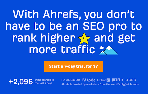
Source: ahrefs.com
5. Provide Options
Finally, you want to make sure your visitors are able to convert in more ways than one. This is especially true for making actual purchases. The more checkout options you offer (and make this clear with the CTA), the higher the chances of making more sales.
The usual “add to cart button” gives shoppers no information at all about the different payment methods available to them. Yet with a simple solution, like this one from Fantasy Jocks, they will know there is Amazon Pay available. This simple piece of information may sway them instantly.
Creating a CTA button for each payment option might be a bit too much, so perhaps your most popular ones would do it. The Book Depository only has two, and they have separate buttons for each. Note by their size which one is their customers’ preferred way to pay.
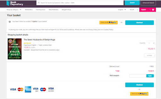
Source: bookdepository.com
Final Thoughts
By using CTA buttons cleverly and ensuring they are designed well, you can boost your conversion rates and help your brand grow.
Of course, what works for some websites might not work for yours. You’ll need to test different versions to help you uncover the best possible solution. Don’t be afraid to experiment, and keep improving on your original ideas until you find the highest-converting CTA button version.