Form Conversion: How to Design Contact Forms That Convert
Practical tips on how to design contact forms that retain users and generate a conversion, keep reading to learn how.

Profession vector created by freepik – www.freepik.com
A contact form is a contact form, am I right? I suppose you could take that approach if you’re not interested in converting website visitors into active leads. You need to design contact forms that keep people from leaving!
Picture the scene…
You’re using a website that you enjoy. Maybe it’s an eCommerce site and you want to sign up for special offers. Or it could be a social network that your friends have all joined. Perhaps you’re considering buying a new piece of software.
However, as you click on the inevitable form that you need to fill out, your heart fills with dread. It’s a messy, and confusing set of questions that makes you wonder just how long this is going to take.
We’ve all been there – even the best online forms can be a drag, and most of us are way too busy to take the time to fill one out if it’s inconvenient in any way. Forms that are badly designed or overcomplicated are enough to put customers off a product for good. 81% of internet users have reported abandoning a contact form.
Despite this, as a business owner, you’re as aware as anyone of the importance of contact forms. Regardless of the type of website you run, you’ll no doubt need to include a contact form to fill out at some point, whether it’s for a newsletter or to complete an eCommerce purchase. A Conversion is just as important to an online business as the hosted VoIP system they use and the quality of their website content.
Newsletters, for example, can be a persuasive tool for client retention, meaning that all businesses should consider including a form to sign up for one when building their website.
Therefore, you must be able to design contact forms that are likely to convert time and again and that won’t scare off your clients. These tips are all vital pointers to keep in mind when designing contact forms – follow them and you’ll create forms that customers might even enjoy filling out!
What should your forms look like?
When a customer opens up a contact form on their mobile phone or a laptop, the first thing that they notice is how the form looks on the page. If clients are greeted with a complex or untidy set of questions and inputs, your form isn’t likely to generate many conversions.
Just like wider UX design, visual design is important to consider when designing a contact form. This section will help you to make a contact form that immediately appeals to a client when they are first opened.
1 – Keep It Simple
This is the most important principle to keep in mind when planning the visual design of your form.
When a customer opens an online form, whether they’re seeking to purchase furniture or cloud contact center software, they’ll naturally look ahead to scan through the whole form. If you include pages upon pages of questions or build a form that has a vast range of questions or information sources it’s unlikely that your customer will persevere to the end.
Instead, you should keep the number of questions and fields to the bare minimum. If possible, exclude any optional fields or questions that are lengthy or complex. The average number of fields is five, so try not to exceed this – customers will subconsciously expect a form of this length.
Similarly, try to ensure that your form can be read and completed in less than a few minutes. If you’re using a tool such as Google Forms that can build multi-page forms, try to fit all of your fields onto one page.
2 – Stick to One Column
Just as pages of questions and fields can put customers off your contact form, a form that has multiple columns can confuse and unsettle users.
While using multiple columns of fields may seem like an effective way to place all of the necessary questions onto one page, clients can often be confused about the order in which questions are to be answered when they are presented in this way. You can avoid this by limiting your number of columns.
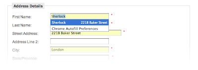
3 – Make Use of Autofill
Clearly, one of the worst things that you can do when designing a contact form is making it appear messy.
One way to avoid this is to implement autofill techniques when producing fields.
Rather than having lengthy dropdown menus with possible options for questions such as a customer’s country, providing an autofill field will keep the form appear simple while saving your customers’ time and allowing them to avoid having to complete the field in full.
4 – Remember That Your Forms are Your Brand
This may seem obvious but it’s easy to treat contact forms as though they are external to the rest of your app or website, especially if you use an external form builder tool. Contact forms are a key way in which clients interact with your business – that’s why you want to ensure that these forms convert and that customers have a good experience using them.
Form builder tools can make the creation of your forms much easier if you just remember, that visual appearance needs to be both appealing to the customer – in order to create a positive image of your brand – and reflect the brand values and design language used elsewhere across your business.
Consider utilizing a digital workplace solution to visualize your company’s workflow and assign resources specifically devoted to brand development to check your form’s design.
Well-designed forms, therefore, should become part of a coherent brand identity as well as a functional tool that frequently converts.
5 – Build Specific Forms for Mobile Devices
In 2018, only 3% of people said that they prefer to use their mobile device to fill out online forms. While this number has likely increased as mobile optimization has become more widespread, many people still prefer to complete forms on a desktop or laptop.
Why is this? Often, online forms are not specifically designed for mobile devices, making it hard for clients to read or complete them on their phones. If a form is designed for a laptop or desktop, important bits of information or fields can be cut off when it is viewed on a smaller portrait screen.
If a customer encounters your form on a mobile device and it is difficult to use, they’re more likely to abandon it.
In 2022, people use a range of different online devices – the best small business phone systems can be accessed across mobile and PC devices, while 33% of Americans’ media time is spent on a mobile device – so you have to ensure that your forms are optimized for mobiles, laptops, and desktops.

6 – Use Design to Encourage Completion
How your form appears on the screen can be used to encourage clients to actually complete and submit their responses.
The ‘call-to-action’ (CTA) button – the part of your form that actually converts the form when the customer clicks it – should be clear and catch the eye. Think about how you can use size and color to distinguish the CTA from the rest of the online form.
For example, if your form ends with a ‘submit’ button, make this CTA at least two times larger than the rest of the text, while you could use a bright color if the rest of the form is black and white.
How should you write your forms?
After making sure that your form is visually effective and having designed the layout of your form to lead to more form conversions, you have to write your forms.
While copywriting online forms may seem straightforward, you have to remember that every word should be tailored for your customers.
By keeping in mind some guiding principles and ideas, you can exploit the persuasive power of your copy, while also designing the specifics of your form to encourage increased form conversion.
1 – Begin Simply
Your forms should begin with the easiest fields and the simplest information. Think about how ecommerce forms, for instance, almost always ask for credit card information or delivery details after simpler information like your name or contact details.
By responding with straightforward information at the beginning of the form, clients are easily and quickly engaged in the form-filling process. Even signup forms for sophisticated business software such as a sales engagement tool should start with simple information such as email details.
Instead of scaring off customers with difficult questions right at the beginning, easing them in means that your form is less likely to be abandoned.
2 – Be Clear

Clarity needs to be the top priority in your copy. Just as you have already reduced the number of fields to a minimum, you should only include and ask for the necessary information. When issuing instructions, be specific and explicit. This is as crucial in contact forms as it is in waiver forms.
However, your instructions will not be absolutely effective every time. If a client makes an error, your form needs to respond and tell them that some information needs to be re-entered.
Everyone has experienced being incredibly annoyed by vague error messages on forms – if they don’t tell you which field is incorrectly filled out or how to remedy the error, you are going to be far more likely to abandon the form.
Therefore, ensure that your form is clear and direct throughout to improve conversion.
3 – Prepare for Users’ Difference
One way of avoiding frustration and user errors is by designing fields that aren’t overly specific or particular.
Dates can be an issue here. Many people will input dates differently – American and European users will order the day and month differently, for instance, while individuals may use dashes, dots, or commas.
Rather than asking clients to re-input their information according to you or your company’s preference, consider using code to convert dates to your style. If this isn’t available, you should be very clear about the format in which you need the responses to be written.
By accommodating customers’ particularities, you will reduce frustration and increase conversion rates.
4 – Make Your CTA Persuasive
We’ve already outlined how important it is to make your CTA stand out visually. It’s also crucial that you use the final part of your form to really convince the user to submit their response.
One way of doing this is by including social proof at this point – highlight how many other people have, for instance, signed up for your newsletter.
If your business uses referral programs for customers you also could incorporate this information as a selling point – for example, telling the client that if they sign up they could refer a friend for a discount.
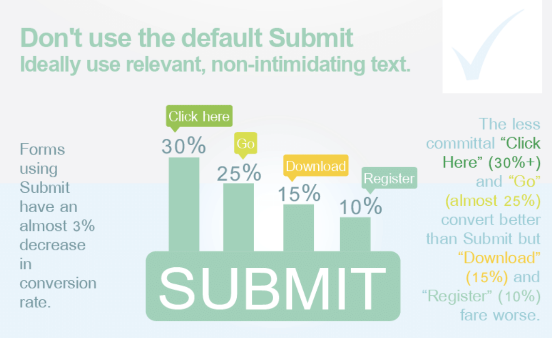
Consider using more dynamic language for your CTA. A phrase such as ‘Let’s Go!’ is far more eye-catching and persuasive than a pedestrian phrase such as ‘Submit’.
Your CTA is the final piece of the jigsaw in creating a form that converts. Don’t treat it as an afterthought.
Key takeaways – The path to contact forms that convert
Now that you’re equipped with the principles and advice to help you to design effective contact forms, it’s time for you to use your new knowledge and go and build your own. Remember to keep it simple, short, and straightforward.
After you have designed your contact form, you should also take the time to test its usability. By analyzing responses to forms, you will be able to recognize the parts of your form that are most likely to lead users to abandon it. You can then tweak your form to resolve any issues that appear in practice.
Whether you want to update existing contact forms to make them more likely to convert or if you are about to design a form from scratch, the guiding principle in this article will help you to build contact forms that don’t drive users away.