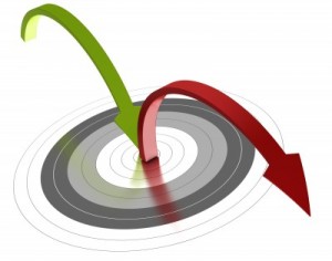 So you’ve worked hard to drive in droves of traffic to your website or blog, but you still don’t see any remarkable results? It looks like your visitors are bouncing off by their numbers, and that should have you worried.
What’s a “bounce” to begin with? Simply put, a bounce occurs when a web visitor leaves your website from the one page they came in through, i.e. they only viewed one page of your website. You know that’s not good for business. So how can you minimize your bounce rate and improve your website conversions? Here a handy list of 7 effective ways to reduce your site’s bounce rate.
1. Improve load time for your pages
Nothing turns a prospective visitor off more than a slow-loading page. Well, there are a number of things you can do to reduce your pages’ load times, including:
- Let third-party content load in the background (lazy-loading), using AJAX. This can be things like external images, widgets, fonts etc.
- Optimizing your images for the web – reduce file sizes using image compressing tools
- Upgrade your hosting plan if you’re receiving a sizeable amount of traffic
2. Limit sidebar options
When a visitor lands on one on of your pages or blog posts, they expect to find what has been promised in the link they clicked. As such, you should place the emphasis on the matter at hand and restrain from packing the sidebar with too many items that the user feels overwhelmed. The sidebar is already a distraction by virtue of being there; if must be that it remains there, you should limit the items to about 3 of the most important. Let the user look to navigation to explore your site further.
3. Know where to place your ads
Ads can be annoying, but you must pay the bills, right? Not so fast. While I do acknowledge that advertisements might be your primary revenue source, it is worth noting that too many ads can dampen the spirit. It’s even worse when you place ads near your main navigation menu, leading to some accidental clicks (away from your site). Don’t place too many ads above the fold; the more difficult you make it for the reader to reach – and distinguish –your content, the likelier it is they’ll leave.
4. Use clean, accessible navigation
Navigation is an integral part of a conventional web design. The web page design that matter. Some flashy web masters ignore such conventions, choosing instead to showcase their stunning designs and mastery of cool web page effects. What they forget is the average website user is used to a certain way of seeing things. If it’s not anywhere near the way it should look, they’ll find it annoyingly difficult navigating around. And frankly, there’s no time to figure out your unorthodox navigation.
5. Show related content
At the end of your blog posts, you should display a list of related posts. You’ve seen this before, and if you haven’t, look right there at the bottom of this post — and you know that it works because you are living testimony, having clicked on several related posts yourself. The same concept is also applied to great effect on ecommerce sites such as Amazon, where you get suggestions of items similar to or related to your item. If you use WordPress, there are many free plugins you can try out to add this functionality.
6. Limit external linking
Linking to external resources isn’t a bad idea altogether so long as it’s not at the expense of losing your visitors. There’s a limit, even when you feel the need to cite a source, to how much external linking is “safe”. Too many links allows the visitors too many chances to leave your website – and they might not come back. One effective precaution is to make all your outbound links open in a new tab. That way the user remains on your site whilst they visit your cited resource.
7. Use a responsive theme design
It’s hardly possible that all the traffic to your website will be accessing it on a desktop. With the rise in mobile usage, responsive designs are the answer to serving both your mobile audience and large screen followers without having to build separate versions for said devices. When you make your website, consider a responsive template or layout as the best option to addressing all the queries of different screen sizes. By your own experience, you can bear me witness that an awkward appearance on mobile devices is also a turn-off.