7 Amazing Mobile Website Designs of 2022
Mobile website designs, who’s doing it right? This post has 7 amazing mobile website designs for inspiration on how to do it the right way.

Whether you own a clothing brand or a remarketing firm, a website is a must for all kinds of businesses.
As many customers are now shopping from their phones, having an online presence is crucial and that brings us to mobile websites.
Having a website for desktops is essential but optimizing it for mobile phones is more important considering over 90% of internet users use a mobile phone (statistica, 2021).
To help you develop a responsive mobile website, we are here with examples of the 7 best mobile website designs of 2022.
7 Best Mobile Website Designs for 2022
Below are 7 great mobile website examples, every site owner should take inspiration from.
- Google Maps
- Shutterfly
- Etsy
- Express
- Microsoft by the Numbers
- American Copper
- Typeform
Now let’s go through each mobile website design and see what makes it stand out.
1. Google Maps

It’s hard to talk about great performance and not mention Google. Running the most successful search engine, Google also offers a great mobile-friendly site for Google Maps.
The mobile website is hard to differentiate from the app as it’s as fast as the app and has the same features.
When you look at it, you will see that even the imagery is the same and the visuals are as pleasing as in the app.
The interface is simple and easy to understand and even for a new user, it won’t take long to get the hang of things.
With so many people using Google maps for navigation and direction, they need to offer the best mobile experience and so far their website doesn’t disappoint.
Key Features:
- As easy as their app
- Great features
- Engaging visuals
- Smooth performance
2. Shutterfly

Shutterfly is an e-store that offers personalized stationery, and cards, and allows customers to make photo books.
As more and more people use their mobiles to take photos and make online purchases, Shutterfly recognized the need to make a mobile-friendly site that works for its customers.
They followed two key principles: Keep it simple and use great visuals. By doing that they made it easy for customers to gain information from their site and added beautiful pictures that made the customer fall in love with their work.
That way they keep the customer engaged while making it easy for them to shop. Their finger-sized top navigation menu and latest promotions are placed very smartly to avoid overwhelming the customer while still getting the point across.
They have used large buttons so the user quickly selects the product they like, and once they click the product, large photos offer a clear and appealing view.
Key Features:
- Easy to navigate
- Amazing visuals
- Intuitive to new visitors
3. Etsy

Etsy is a popular e-store where people can buy cool vintage items and handmade products. Their site is simple, the images are not distracting and there is a prominent button that you can use to open their app.
Their images are the perfect size to engage the audience from their phones. The site only has necessary info added to avoid clutter. The site has a prominent search bar to facilitate the customer and to display images beautifully, they use a grid-based format with photos.
Their home page has product categories, the latest products, and useful information, all laid out perfectly so the user can quickly understand what the brand is all about.
The overall site is simple, and elegantly designed and on top of all that, it’s aesthetically pleasing to the eyes.
Key Features:
- Simple Interface
- Aesthetically pleasing images
- Prominent search bar and app button
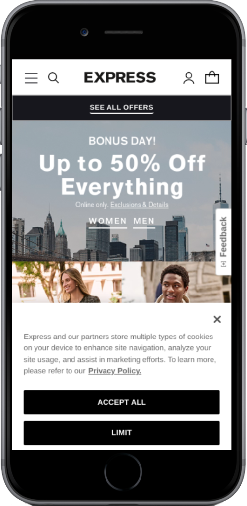
4. Express
Express is a popular clothing brand that has a stunning mobile site. As imagery is very important for a clothing brand, their site displays big, clear images of their items.
Prices and short descriptions are also mentioned below, so the user doesn’t have to click each image to find the necessary info.
A cool feature of the site is that when you slide your finger from left to right over an image, the image changes. That way you can see a different view of the product without having to load a new page.
That is super convenient for lazy shoppers who don’t want to open multiple images and want quick results.
Key Features:
- Convenient shopping experience
- Stunning Images
- Simple interface without clutter
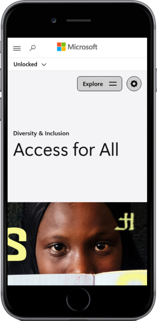
5. Microsoft by the Numbers
Microsoft by the Numbers is a cool website that shows statistics and numbers related to Microsoft.
Their mobile site is user-friendly and when you scroll up it reveals positive statistics with eye-catching graphics. For more information, you can click the provided links as well.
That way users looking for quick info get what they want while more information can also be attained for users looking for details.
When a user scrolls down he gets to see statistics with negative values while scrolling left to right gives the same effect.
That makes their site super easy to use and motivates customers to visit them again and again.
The page also includes a hamburger menu with shortcuts to statistics for those in a hurry along with social media icons and a language selection menu for easy selection of a preferred language.
Key Features:
- Simple and fast browsing experience
- Intuitive and convenient interface
6. American Copper
American Copper is a luxury apartment rental business based in Manhattan. As they offer luxury apartments, their site should express that and they do so brilliantly.
The images are beautiful and rightfully represent their services. The mobile responsive design of their site adjusts seamlessly to any screen size, and the user can tap, click, or scroll to various page sections.
What stands out the most is the automatic slideshow of different apartments which gives a complete visual experience, even allowing you to pause for a longer look.
On top of that, the image carousel of rentals is swipeable, offering more visual content, targeted at engaging the audience for longer without taking up valuable space.
The site includes large CTA buttons, and minimal contact forms. There is also a call and chat button to offer quick customer service.
Key Features:
- Great visuals
- Swipeable image carousel
- Large CTA buttons
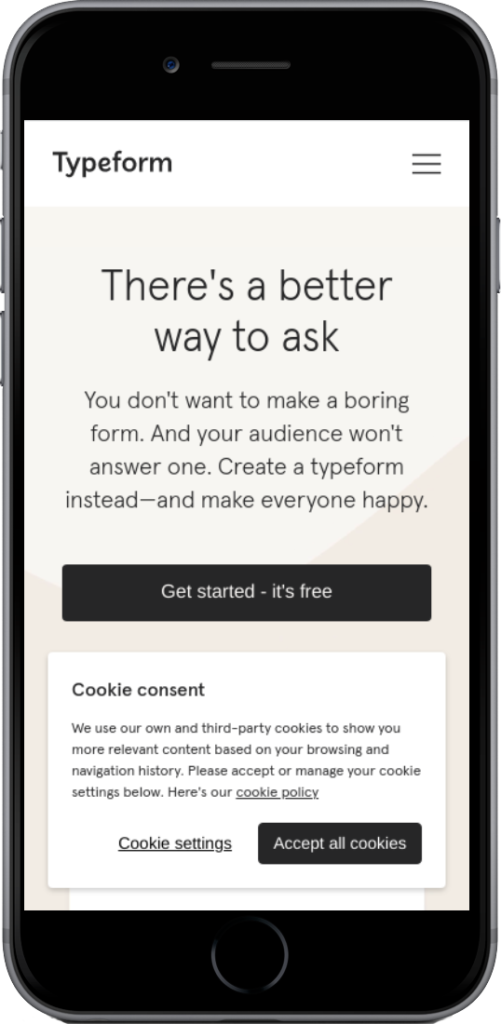
7. Typeform
Typeform is a tech company and its mission is to make forms simple and easy. Their site reflects that purpose by offering a simplified version of their desktop.
While their desktop version is elegantly designed with animations, succinct copy, and other complex design components, they simplified their mobile website.
Considering the mobile site would appear cluttered if the same website is used for both desktop and mobile, they removed certain items.
Even after the changes, their site is still engaging and interesting and as a result of the changes, it loads fast and saves the user’s time.
The text is on point and the use of large buttons makes it easy to tap the product with your finger and get started.
Key Features:
- Site loads fast
- Offers a simple interface
- Provides a smooth user experience
6 Design Tips for Mobile Websites
Below are some useful design tips you can consider while optimizing your site for mobile users.
- Use Large Buttons
- Make the Text Large Enough to Read
- Use Collapsable Sections
- Consider Thumb Scrolling
- Keep Content to the Point
- Optimize for Portrait Orientation
Now let’s explore each tip and see how it works for mobile websites.
1. Use Large Buttons
Imagine that you are scrolling a site on mobile and the buttons are too small. What will you do? You might zoom in or try to make sense of what you are seeing but many don’t spend that much time and might bounce back.
That can be avoided by keeping buttons large enough to be viewed and understood without any zooming. That way users can quickly view and click what they like.
Also, make sure to add adequate spaces between hyperlinks because when links are placed too close, it can be confusing. The user can end up clicking the wrong link which leads to a bad customer experience.
2. Make the Text Large Enough to Read
This is a very basic and understood requirement when it comes to designing a mobile-friendly site. The content should be readable and large enough for most users.
As user attention span continues to decrease, adding large text is important for quick understanding.
According to the screen size, the text should fit perfectly so users can easily read and take action.
Let’s take the example of the Prices Pakistan mobile website, which offers technical information on electronics and mobile phones. On their site, the text is on point and perfectly placed to complement the imagery.
When you click their mobile phone section, you will see that they display key info in an engaging way like mobile prices, ratings, and mobile phone names with clear images.
3. Use Collapsable Sections
Mobile websites have limited room for objects and as the existing space is used for the most important elements, secondary elements can be added in a collapsible section.
With less room for text and long details, using collapsible sections is a great idea. That way when a customer wants more details they can simply click and a new section will appear with all the info.
If they are in a hurry, then they can view the primary sections and call it a day!
4. Consider Thumb Scrolling
Nowadays most users navigate and scroll online using only their thumb. That means that you should optimize your site to be used by a thumb or an index finger only.
As explained before, use large buttons and display text in the right size so users can view and tap what they like instead of zooming in.
The more they have to use their fingers the more inconvenient their experience becomes which should be avoided at all costs.
5. Keep Content to the Point
While you would want to add all the info the user would need on your site, overdoing that can be very harmful.
Lots of text can make your site cluttered and deter the user. Thus, use only the most important text and catchy copies to engage the user and get your message across in minimum words.
6. Optimize for Portrait Orientation
Most mobile users these days prefer a one-hand portrait mode while scrolling online and that is why optimization for portrait orientation is very important.
Although landscape mode is possible you should focus more on the portrait mode. The portrait mode is narrow making it perfect for single-column layouts.
Place the site elements sequentially from top to bottom, alternating with left and right justification to create visual interest. Present smaller elements like icons and photos in a grid to create a visual appeal.
Taking the example of the BlogPakistan site, they have organized their mobile site perfectly for portrait mode. The images and text are systematically placed for easy understanding and the front search helps the user to carry out quick searches.
Final Words
In this article, we explored 7 great Mobile Website Designs with examples that every site owner needs to consider. We found out that these popular mobile sites promote easy navigation, simplicity, and a great visual experience.
Keeping the site simple helps the user to easily understand what is going on and to easily navigate, while great visuals help keep users engaged.
Placing large buttons and offering only the key text is another great takeaway from the above mobile website examples.
We hope this article proved useful and helped you in understanding mobile websites better. Check out more content like this and helpful tips on the site.